- Mar 9, 2021

Which Fonts to Use on Your Scientific Poster
Choosing the right font (A.K.A. typeface) for your scientific poster is all about two things: readability and style.
But with thousands of fonts to choose from, it can be overwhelming.
So where do you start? You’ve come to the right place.
Here is what you need to know to choose a clear and stylish font for your scientific poster.

Serif or sans serif?
A serif font is one with those little bits on the end of the characters, the little moustaches. And, like a moustache, those little bits are just for style - they might be cool, but they’re not necessary.
What’s more, a serif font tends to give off a sophisticated, yet dated, vibe. As you want to your poster to reflect the innovative and contemporary research you’re conducting, it’s a good idea to stay away from serif fonts.

You need a font that is without serif, that’s sans serif. We recommend downloading your next favourite Sans Serifs fonts at Creative Fabrica . 👈
How many fonts?
Like so much of good design: less is more.
One or two fonts is all you need. If you have more fonts than this, your poster will look like a ransom note received in the mail.
As you know, it’s a good idea to make the headers clearly visible so help the viewer navigate the poster.
You can do this by making the headings bold or ALL CAPS. If you like the look of all caps, I strongly recommend against using any long headings. Long chucks of all caps is very difficult to read. So keep your headings short.
Decorative fonts
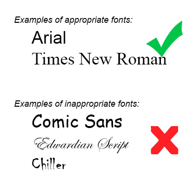
Look, I get it. You found the Disney font and you want to use it on your poster. A decorative font may be tempting, but it’s just not helpful - they’re very rarely easier to read than the standard sans serif fonts available. Take a look below to see what I mean.

Comic Sans?
Comic Sans is a sans serif font, it’s also fun - can we use it on our scientific posters?
Every time a scientist uses Comic Sans a graphic designer dies
BUT there is one exception. That is if your poster IS a comic!
If that’s the case, go for it! In this context Comic Sans is perfect and it would almost be a crime not to use it. Here’s a comic-style graphical abstract that is a perfect partner for the much maligned Comic Sans.

Bigger is better. At Animate Your Science, we believe posters are best served as a visual representation of your abstract. It’s about starting a conversation and that’s it - the rest is up to you.
So a poster with few elements, that can be seen from across the room, is perfect.
For this we recommend the following font sizes as a minimum for your text (based on an A0 size):
Headers : 40
Body text : 36
Your body text should be easily readable from 1 metre away.
To check that you have the right sizes, I suggest zooming in on your poster to 100 %. Then, take a step back to a metre or so. If you can clearly read the body text, then at a minimum, your text is big enough. You can use the same technique to test the sizes of your headers and title too.
Some suitable fonts
You have plenty of fonts to choose from. You’re not even limited to those default fonts installed on your computer. Check out Font Squirrel , Dafont , and 1001freefonts where you can download some new fonts for free.
For some ideas, check out these fonts:

That’s plenty of info dedicated to fonts for your scientific poster, so thanks for hanging in there with me.
But, we’ve only just scratched the surface on what makes a great scientific poster.
To properly cover this topic, we’ve developed a whole online course: How to Design an Award-Winning Scientific Poster. You can learn at your own pace and arm yourself with the tools, templates, skills and knowledge to create your own award-winning scientific posters. We’ve had excellent feedback on the 33 video lessons, 3 hours of learning and 8 templates & downloads included - so we’re confident that you’ll love it too.

Take-Away Points
One or two fonts
Sans serif is your friend
Make it large enough to be easily readable
Dr Tullio Rossi
Dr Flynn Slattery
#scicomm #poster #science
Related Posts
How to choose appropriate font sizes for your scientific poster
Scientific posters: a step-by-step planning guide
How to select the best images for your scientific poster


Research Poster Presentation
- Planning & Preparation
- Layout & Content
- Color Scheme
- Images & Graphics
- Review & Printing
Beginning Graphic Design: Typography
Best Practices
Choose your fonts
For maximum impact, choose different fonts for the header and body of your poster. Select a serif font for your title and a sans serif font for the body. Serif fonts, such as Times New Roman and Garamond, have short lines at the ends of the strokes in a letter (as indicated by the arrows in the images below); sans serif fonts, such as Helvetica and Arial, do not.

Some common font pairings and recommended font sizes can be found below.

Size appropriately

- 33 perfect font pairings
- The art of mixing typefaces - Google Fonts edition
- The ultimate guide to font pairing
- Poster Design And Layout: From Font Sizes To Color Contrast
- << Previous: Color Scheme
- Next: Images & Graphics >>
- Last Updated: Jul 16, 2024 2:06 PM
- URL: https://researchguides.wcu.edu/researchposter
HUNTER LIBRARY
176 Central Drive Cullowhee, NC 28723 Administration: 828-227-7485 Reference: 828-227-7465 Circulation: 828-227-7485

QUICK LINKS
Ask-A-Librarian Reserve a Study Room My Account Library Catalog Article Databases Interlibrary Loan
- Presentations
- Most Recent
- Infographics
- Data Visualizations
- Forms and Surveys
- Video & Animation
- Case Studies
- Design for Business
- Digital Marketing
- Design Inspiration
- Visual Thinking
- Product Updates
- Visme Webinars
- Artificial Intelligence
20 Best Fonts for Presentations In 2024 [PowerPoint or Not]
![20 Best Fonts for Presentations In 2024 [PowerPoint or Not]](https://visme.co/blog/wp-content/uploads/2021/01/header-2.png "best fonts for poster presentation")
Written by: Chloe West
Choosing the best font for your presentation can mean the difference between an engaged audience and one that’s confused or distracted. A presentation font needs to be legible, agreeable, and not interfere with the content itself.
But choosing a font isn’t always straightforward.
To save you time and effort, we’ve selected 25 of the best fonts for presentations. This list will help you find the best font for your next presentation, whether you’re using PowerPoint, Google Slides, Keynote or any other tool to create it.
Simplify content creation and brand management for your team
- Collaborate on designs , mockups and wireframes with your non-design colleagues
- Lock down your branding to maintain brand consistency throughout your designs
- Why start from scratch? Save time with 1000s of professional branded templates
Sign up. It’s free.

Choose the font that you like from the list below and see when (and if) you should use it. And the best part? Each of these, and 500 more fonts are available for free in Visme's presentation maker .
Here's a short selection of 8 easy-to-edit Presentation templates you can edit, share and download with Visme. View more below:

26 Best Fonts for Presentations
- Archivo Black
- Libre-Baskerville
- Abril Fatface
- League Spartan
- Playfair Display
- DM Serif Display
- Dela Gothic One
Presentation Font #1: Lato

We’ve all seen a million and two presentations using standard fonts like Arial and Times New Roman. Lato often serves as a default font choice in many cases. This sans-serif typeface offers a more contemporary appearance.
Plus, the variety of weights that Lato is available in – from thin to light to bold and more – helps to ramp up this font’s overall appeal.
This font can be used in a variety of different ways, as we’ll see in the presentation templates below.
In this presentation below, we see Lato used as the header font in each slide. It’s paired with a thicker serif font to create a nice balance between the two types of fonts.
Here’s another presentation example using Lato as the main header. Both of these examples are using Lato Light to create a more sleek and modern look in their slide decks.

However, as we see in the above presentation, Lato’s normal and bold weights work perfectly for offsetting the light in various headings and designs.
Lato is a modern and readable font, making it perfect for nearly any type of presentation. However, it works perfectly for conveying your professionalism in a pitch deck as well, like we’ve shown you in these examples.
Presentation Font #2: Roboto

Another great font to use in your presentations is Roboto. Roboto is yet another basic sans serif font that works across a variety of industries and types of presentations .
Roboto is a suitable font to use for your body text, like we see below in this presentation.

All of the main body paragraphs are easy to read in Roboto, as well as professional and well designed.
We see Roboto used again below in this presentation sharing workout apps.

Here, it’s also used as the main font for body copy within the presentation. This just goes to show that this font can be used for nearly any type of presentation as well as any industry.
Roboto also pairs well with many other fonts, whether a serif like Garamond, a sans serif like Gill Sans or a script like Pacifico.
Presentation Font #3: Bentham

Bentham is a stunning serif font that works perfectly as a header font in your business presentations . It’s easy to read and gives your presentation a more traditional look and feel.
We use the Bentham font in our simple presentation theme, as you can see below.

This font can be used as uppercase, title case or even lowercase, whatever fits in best with the rest of your design. In the simple presentation theme, we have over 300 different slide styles to help you put together a unique and beautiful presentation.
Bentham is a free font that you can easily access inside Visme when creating your presentation design. Add letter spacing to create a different effect on your slides.
Pair Bentham with a sans serif font for your body copy like Open Sans (that we’ll cover shortly) or Futura .
Create a stunning presentation in less time
- Hundreds of premade slides available
- Add animation and interactivity to your slides
- Choose from various presentation options

Presentation Font #4: Fira Sans

Fira Sans is a stunning font that is incredibly versatile. In fact, you can utilize Fira Sans as both your header and body font, with another font in the mix to act only as an accent font.
See what we mean in this PowerPoint template below.

While Fira Sans is used in both normal and bold weights for the majority of the slide content, we see a nice serif thrown in as well to offset the single presentation font.
We can see Fira Sans used in multiple ways in this informational presentation template below as well.

This gorgeous sans serif font can be used in bold, italic, underline and more, giving you a wide variety of uses for this one font selection. Give it a try in your next presentation.
Presentation Font #5: Archivo Black

Archivo Black is a bold and strong font that looks powerful in all caps, like in the presentation example below. This font works perfectly on titles in both large and smaller sizes because it has a heavy presence.

In this presentation, Archivo Black is paired with Work Sans, a perfectly agreeable sans serif font that is easy to read in body text and captions.
When deciding what fonts to pair together, take a look at the Font Pairs collection in the left-hand toolbar of the Visme editor. In there, you’ll find hundreds of great pairings to use in your presentations.
Presentation Font #6: Montserrat

Montserrat is a big favorite of ours here at Visme given that a large majority of our own headings across our website are done in this font.
However, it’s one of the top font choices you can use as well for the headings on your PowerPoint slides.
Check out how we’ve used Montserrat as a header in this marketing plan presentation template.

It’s bold and helps your slide titles and headers to stand out to your audience, letting them know exactly what to expect each time you move to a new slide.
Here’s another example where we’ve used Montserrat, but this time we’ve used a thinner version in the header.

This versatile font almost looks like a completely different typeface when you switch up its weight, giving you even more flexibility for using it across your various presentations.
As you can see, Montserrat can be the font to choose when creating a marketing or business plan presentation as it’s both professional and visually appealing.
Montserrat also pairs well with a variety of different fonts. Try a thin sans serif for a nice contrast in your next PowerPoint.
Presentation Font #7: Open Sans

Open Sans is a commonly used font for body paragraphs in your presentation slides due to its legibility. Because it’s a basic sans serif font, it’s the perfect way to visualize the larger pieces of text you might need to include on a slide.
Here’s a presentation template that showcases Open Sans as the main font for the body copy.

However, Open Sans shouldn’t be discounted as only a paragraph typeface. In fact, you can also use it in professional presentations to help your headings stand out clearly, increasing readability.
Take a look at this stock pitch presentation that uses Open Sans as the large font for the title and headings on each page. We used Open Sans in two different weights, creating a font pair that looks balanced and unique.

If you’re looking for the right font to ensure your presentation is easy to read and digest, Open Sans is a great choice.
Presentation Font #8: Dosis

Dosis is another go-to presentation font for any industry. It’s a fun sans serif font with rounded edges and tall, thin letters, giving it a more futuristic look.
Here’s an example of how an industry focused presentation can use Dosis in – a slide deck for a restaurant’s marketing plan.

In this example, Dosis is used in all caps on the title slide and in the headings on each slide. This template has added a unique design that incorporates a two-color composition that makes the font contrast with the background.
Below, we have another impressive presentation template using Dosis in a similar fashion. It’s paired here with sans serif font Source Sans Pro, providing a modern combination fit for a tech startup pitch deck.

Similarly, we see that Dosis works well in all caps and can be used in a variety of designs in order to make the text stand out that much more.
Presentation Font #9: Libre-Baskerville

Another quality PowerPoint font to consider using in your presentations is Libre-Baskerville. This is a Google font that you can use for free inside many presentation software , Visme included!
Libre-Baskerville is a serif font style that can be paired with a variety of other fonts and color schemes, creating a more traditional look and feel for your presentation.
We use Libre-Baskerville in all caps as headings in our Modern presentation theme. This theme has over 800 different slide designs so you can pick and choose the ones that work best for your presentation needs.

However, this font can also be used in body paragraphs just as easily, as it’s clear and legible and easy to read.
In the presentation template below, we’ve paired Libre-Baskerville with Josefin Sans in the header, creating a classic look and feel for any presentation deck .

Libre Baskerville is a timeless font choice that never goes out of style and adds a sleek touch to any presentation you need to create.
Presentation Font #10: Muli

Muli is a versatile font that looks professional in both headings and body copy. As a sans-serif font, it’s bottom-heavy, so it sits well on the line, giving a sense of control. Its roundness makes it friendly and easy to read.
This presentation uses Muli for the titles in a medium size and a lower size for small headings. The pairing of Muli with Lato works well with the colors and shapes in the rest of the design.

Presentation Font #11: Abril Fatface

If you’re looking for a bolder font that grabs attention, a slab serif like Abril Fatface might be just the font you’re looking for. This could pair nicely with a standard font like Helvetica or Verdana or a thinner serif like Georgia or Palatino.
Check out how we’ve incorporated this bold font into the headings of the below annual report presentation design.

Abril Fatface is a great font for creating eye-catching headlines on your slides, but should only be used with short headings or pieces of text. A bold font like this can be hard to read in paragraphs or longer sentences.
Look at how good this Abril Fatface looks on the 3rd slide of this presentation.

The presentation below also uses Abril Fatface for the headings on each slide. The font has so much personality that it looks beautiful on its own and placed over bold colors.

If you’re looking for a slab serif font alternative, use fonts like Rockwell or a bolded Trocchi in your next Visme or PowerPoint presentation .
You could even look into custom fonts from sites like DaFont and import them into your Visme brand kit .
Presentation Font #12: KoHo

The next font on our list is KoHo, a unique sans serif font that can be used in more playful presentations.
Whether you’re creating a presentation for school , a video presentation to play in your office or something else entirely, KoHo can be one of the best fonts to utilize.
We incorporated KoHo into our Creative presentation theme in the various headings of each slide.

This is another one of our massive presentation themes, offering hundreds of slide designs for you to choose from. However, as the name suggests, this one has a more creative and playful feel to it.
If you need to create a pitch deck for investors or a sales presentation for new clients, KoHo and the Creative theme might not be for you.
However, if you’re embedding a slideshow onto your blog or sharing an informational presentation on SlideShare, KoHo could be a better suited choice to engage your audience.
Presentation Font #13: Helvetica

Helvetica is a classic sans serif font that has a very loyal fanbase, and for good reason.
As seen most clearly in capitalized texts, the upper half of the texts are quite large when compared to other san serifs fonts.

This allows the Helvetica fonts to have near-symmetrical proportionality when measuring the upper and lower portions of a text. These proportions make the identification of letters easier at a distance, like in the template example above.
This fact makes Helvetica a great font to use for headers and titles in live presentations where there may be people “sitting in the back row ” and viewing your presentation from a distance.
To clearly communicate your main points, be sure to use Helvetica as a bold text on headings and titles.
Presentation Font #14: Cormorant

Cormorant is a sleek and modern serif font.
We like to think of Cormorant as a good alternative for Times New Roman but with a moderate and tasteful change.
With a dynamic range of varying thicknesses, Cormorant appears to have a calligraphic feel and look while still maintaining a sense of professionalism.

While artistic and expressive, Cormorant is still fully legible and usable in a professional environment, as you can see in this presentation template.
Our recommendation is that you choose a font color that is a complementary color to the background. This helps separate the thin portions of the font from the background.
Should the variations in thickness prove too much for your taste, consider dialing back that expression by using Cormorant in its bold format. By thickening up the thinner lines, the variations are less noticeable and may be more suitable for a given context.
Cormorant is a modern serif font that works well in titles, headings, subtitles for subpoints or paragraphs.
Presentation Font #15: Prompt

Prompt is a geometric sans serif font designed for Latin and Thai languages. Its geometric quality gives it a solid and stable feel that will give your presentation a unique look.
In this modern presentation example, Prompt appears in all titles and subheadings. It’s paired with Montserrat, another san serif with personality. These fonts together do look a bit similar to each other but balance each other out in terms of weight and thickness.

Choose this font specifically if you’re creating a presentation in Thai and need the words to be legible and well-balanced.
Presentation Font #16: League Spartan

League Spartan is a simple sans serif font, that is bold, uniform and minimalistic by nature and is great for headings and titles.
Because it's hefty even with the bold setting turned off, you may want to take extra precautions when using League Spartan for paragraphs or letter bodies.

League Spartan works great as a header for infographics or cartoon-style presentations, like in the template above.
The purpose of an infographic is to take difficult or complex information and turn it into easy-to-remember points. The reason that League Spartan works so well with infographics is its simplicity.
To help set the overall tone of an infographic, you can use a simplified san serif font like League Spartan. A font like this will simplify an important or complex data point and make it feel easy to understand.
Presentation Font #17: Poppins

Poppins is a versatile and linear san serif font.
Poppins is linear because of its strong vertical terminals, which are the end of a stroke that is not a serif. This gives the font a sense of weight and vertical authority, making it great for strong, stand-out titles and headers.
Not only is Poppins a wonderful choice for titles and headers, but it also works well for titles, text bodies and subtitles, as you can see in our presentation template below.

The linear and versatile aspects of Poppins has made this font a favorite in the business and professional world. It feels casual, yet is still very professional.
Presentation Font #18: Playfair Display

What can we say about Playfair Display, other than it’s an incredibly chic and fashionable serif font.
This font has a strong box feel as most of the characters stay between the baseline and X-height. This means that most of the letters do not dip far below the line, nor do they rise above most of the other letters.
This makes Playfair Display an excellent choice for strong titles and headers, as you can see in our presentation template below.

Many fonts that go after the “box look” fail at being legible from a distance.
To avoid this problem and make the letters more pronounced, Playfair Display uses a variety of thicknesses in the stem of their letters when compared to the arms and other extensions.
Playfair display is a classy and elegant font designed to be used as headers or titles. While it can still be used in paragraphs, you may want to limit its usage to shorter portions of your text.
Similarly sized and spaced words written in this style can be disorienting for some readers. So instead, consider using Playfair Display as a font for titles, quotes or various subtitles in your presentation.
Presentation Font #19: Raleway

Raleway is a modern sans serif font that was originally designed to be used as a lightweight font. But after its release and by popular demand, Raleway was given heavier and italicized versions for its fans to use.
The bold and light versions of this font are extremely versatile and can be used anywhere from bold headers to lighter parts of the body in your presentations, as you can see in our presentation template below.

The italicized version of Raleway has slightly off-centered bowls and shoulders in certain letters. This means that the markings that are not the stem are purposefully written higher or lower than normal.
This is a subtle artistic flair that does not influence readability. Some people find that swashes actually help increase legibility with these off-centered markings.
Presentation Font #20: Otama

This type of font pairs well with a solid sans serif like Lato Light. In this presentation example, Otama and Lato Light in all caps work together to create a professional design that stands out and makes a statement.

Presentation Font #21: Lora

Lora is a unique serif font that was made in a contemporary style.
Drawing its inspiration from calligraphy and traditional fonts, Lora is an excellent balance between an artistic and professional font.
Lora has very pronounced arches leaping away from the stem of each letter. This gives the font family a more “bubbly” feel to it, while still maintaining a sense of clean professionalism.
To unleash Lora’s true artistic nature, you’ll want to turn on the italics. When italics mode is activated, each letter receives additional swashes, giving it a more hand-written feel.
If you add weight to its default thickness, Lora works well for both titles and headers and when set to its default settings, Lora truly shines as a font in paragraphs and bodies, as you can see in our presentation template below.

Presentation Font #22: Inter

You can use Inter in different weights throughout a presentation or pair it with a versatile font like Lato Light to give the composition a bit of visual variety. The presentation example below uses Inter in mixed-case and Lato Light in all-caps for headings and mixed-case for body text.

Presentation Font #23: Noto Sans

Noto Sans is a basic sans serif font that makes for a great presentation font. Clean and easy to read, it can be used in a variety of different ways from slide to slide.
Take a look at this presentation template below. The main font used throughout the headers and content is Noto Sans, creating a clean and cohesive presentation design.

The above presentation template also uses a script font for the author name on the first slide as well as another sans serif font (Poppins) for some body content.
Having a nice mixture between the two ensures the presentation isn't boring—but it's still clean and uncluttered. Poppins is another font on this list. Try mixing 2-3 different fonts from our recommended fonts to create a stunning presentation design.
Presentation Font #24: Heebo

Heebo is one of the more unique sans serif fonts on our list, but it works perfectly for presentation slide headers. As a thin, tall font, it works better in a larger size than it would for content.
Take a look at how we've used Heebo in this presentation template below. It remains in an all-caps format, typically for headers from slide to slide.

We've also creatively used the font by juxtaposing it atop purple squares, helping to create a design element out of text. Consider how you can do the same thing in your presentations.
Presentation Font #25: DM Serif Display

Our next top font is a beautifully bold serif font. DM Serif Display is a perfect header font for a more traditional presentation design. Serifs tend to seem more old-fashioned, so keep that in mind when creating your next presentation. Maybe a serif will best fit with your audience.
Take a look at this template below to see DM Serif Display in action.

In the above presentation, we've paired this bold serif font with a nice thin sans serif to pull the design together. Sometimes opposites attract and help you to create a beautiful presentation design that your audience will love.
Presentation Font #26: Dela Gothic One

Dela Gothic One is a thick and chunky font with a strong feel. It’s ideal for headings on posters, packaging and in titles on presentations. This font has a lot of power and is best paired with a simple sans serif font or even a classic serif like Garamond for body copy.
For a bolder outcome, use Dela Gothic One in all caps, like we did in the presentation example below. Each slide includes a strong title in Dela Gothic One in a color that contrasts with the background.

Ready to Create Your Next Presentation?
When it comes to fonts for PowerPoint (or any other presentation platform), there are so many options to choose from that it can get overwhelming. But selecting fonts doesn't need to stress you out. Stick to the ones in this list and you’re sure to have a winner.
Whether you use Microsoft PowerPoint , Apple Keynote or Visme, each of these presentation fonts can really bring the best out of your presentation.
If you want to get even more out of your presentation design and have access to top notch animation, transition and interactivity capabilities, sign up for Visme's free presentation maker today .
If you're racing against the clock, take advantage of Visme’s AI features, like the AI Presentation Maker which takes a text prompt and turns it into a fully designed presentation draft.
Create beautiful presentations faster with Visme.

Trusted by leading brands
Recommended content for you:

Create Stunning Content!
Design visual brand experiences for your business whether you are a seasoned designer or a total novice.
About the Author
Chloe West is the content marketing manager at Visme. Her experience in digital marketing includes everything from social media, blogging, email marketing to graphic design, strategy creation and implementation, and more. During her spare time, she enjoys exploring her home city of Charleston with her son.
- Locations and Hours
- UCLA Library
- Research Guides
- Research Tips and Tools
Poster Presentations
- Size, Layout, and Text
Elements of a Poster
Change size in powerpoint, using the ruler, grid, and guides in powerpoint, more powerpoint training, template resources, font choice, text alignment.
- Colors and Images
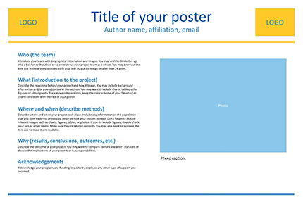
Your poster should include these elements:
- Author(s), with affiliations and emails
If your poster is a representation of a research study, you will want to include the following sections:
- Introduction or objective
- Conclusions and/or discussion
- Acknowledgements
If your poster is a representation of an event or other kind of project, you may want to forego formal abstract sections in favor of the 5 Ws:
- Who (introduce the author, organization, or community)
- What (what did you do? how did you do it?)
- Where (where did you do it?)
- When (when did it take place?)
- Why (what are the outcomes, implications, or future possibilities?)
To change the size in Powerpoint:
- Go to the Design tab and choose "Slide Size" (it's on the right size of the ribbon)
- Choose "Custom Slide Size"
- Change "Slides sized for:" to "Custom"
- Fill in your desired width and height.
Click the View tab to see checkboxes that will allow you to turn on the Ruler, Grid, and Guides (click the image below to see a screenshot).

Ruler : Allows you to see the dimensions of your slide. You'll see a vertical and horizontal ruler.
Grid : By default, the gridlines are 1 inch apart. Right click in white space of your poster to get more options for spacing. This enables precise alignment.
Guides : By default, you'll get one horizontal and one vertical guide placed in the center of your poster. Right click on a guide to add more guidelines, or to delete one. You can use Guides to invisibly define columns of your poster, margins, and more. This gives you manual control, alternatively, you can use Smart Guides (see below).
Smart Guides : Powerpoint has a built-in system for showing you alignment as you move objects around. The video below demonstrates what Smart Guides look like.
Once you've got your slide layout set, you'll want to start creating Shapes and Text Boxes. Here are some tips and tricks for working with objects:
- Use Ctrl+D to duplicate any object.
- Then you can format them all at once, identically!
- You can also group them, for easier movement and alignment (right click to see the Group option).
Most posters are landscape (horizontal) orientation. The title/author(s) will be across the top, with 3–4 columns below that contain the rest of the poster elements. Make sure you leave plenty of white space in your design—a poster crammed full of text and images is very difficult to read.
Here is an example of a 2 column poster layout using the 5 Ws for headings (who, what, where, when, and why):
Use the links below to download this template and other similar templates in two sizes: 24x36 and 36x48. These templates include a variety of placeholder elements for photos and figures.
- 2 column Powerpoint template, size 24x36
- 3 column Powerpoint template, size 24x36
- 3 column Powerpoint template, size 36x48
- 4 column Powerpoint template, size 36x48
Below are some additional web resources where you can search for templates. Keep in mind that you may need adjust the size of a template for your own poster. Alternatively, you can use the resources on this page to design your own layout in Powerpoint.
- David Geffen School of Medicine poster templates Although this is labeled for the sciences, the information can be used in many disciplines.
- Penn State poster template
- PhD Posters
- MakeSigns.com poster templates
- The body of your poster should have a minimum 24 point font . Viewers should be able to read your smallest text from a few feet away.
- The title of your poster should have a 50+ font size, depending on the size of your poster and the length of the title.
- Do not use all uppercase letters for the title or body of the poster.
- Avoid using more than 2 or 3 different fonts in one poster.
- Stick with basic fonts like Times New Roman or Georgia for serif, or Arial or Helvetica for sans-serif. Avoid elaborate, difficult-to-read, or cartoon-like fonts.
- In general, left-align your text boxes (with the possible exception of your title and any image captions). Avoid centering the text on your whole poster.
- << Previous: Home
- Next: Colors and Images >>
- Last Updated: Nov 9, 2023 2:31 PM
- URL: https://guides.library.ucla.edu/posters
Home » Canva » 21 Canva Fonts for Posters That Instantly Capture Attention
21 Canva Fonts for Posters That Instantly Capture Attention
- December 21, 2023

- Written by a professional
Summary: In today’s article, I've selected 21 of my favorite Canva fonts for posters. The 3 that I loke the most are:
- Garamond : Elegant and timeless, perfect for classic themes.
- Impact : Bold and condensed, ideal for making strong statements.
- Sego : Sleek and modern, great for clean designs.
Finding the best poster font in Canva can be a fun and easy process. In this guide I'll help you explore Canva's collection of fonts perfect for any type of poster. Whether you're working on a professional presentation or a personal project, the right font makes all the difference. We'll look at options that are bold, modern, or classic, ensuring your poster stands out and communicates clearly. Let's dive in and find the font that'll make your poster pop!
TOP 21 best Canva fonts for posters
- Garamond – Free
- Impact – Free
- Sego – Free
- Gotham – Free
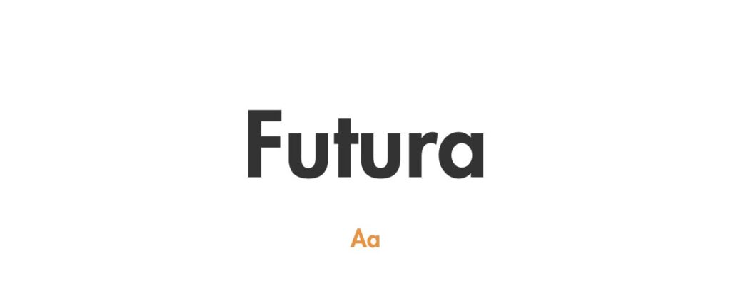
- Futura – Free
- Giaza – Free
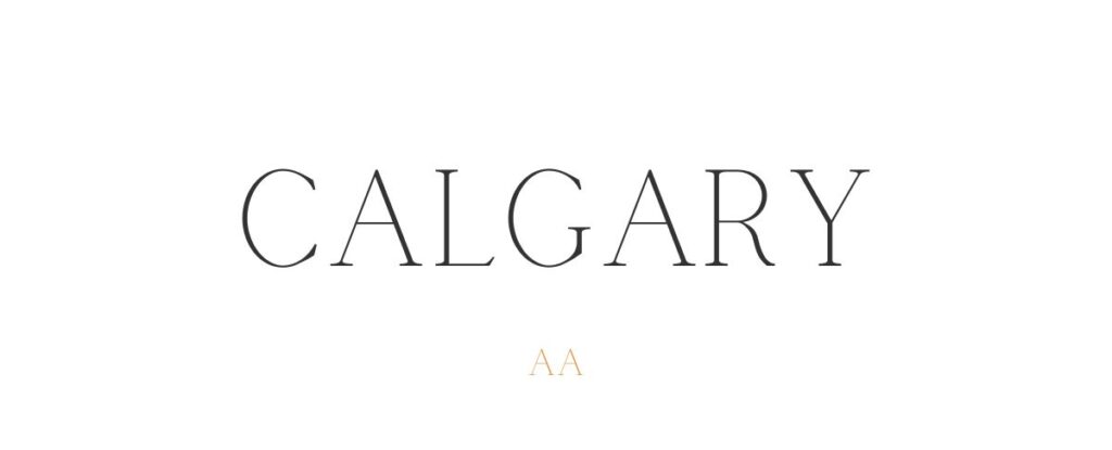
- Calgary – Canva Premium
- Nectarine – Free
- Kare – Canva Premium
- Vangeda – Free
- Shrikhand – Free
- Amatic SC – Free
- Brasika – Free
- Gliker – Free
- Cinzel – Free
- Lucky Bones – Free
- Railey – Free
- Gulfs Display – Free
- Dream Avenue – Free
- Avatar – Canva Premium
- Komorebi – Free
1. Garamond
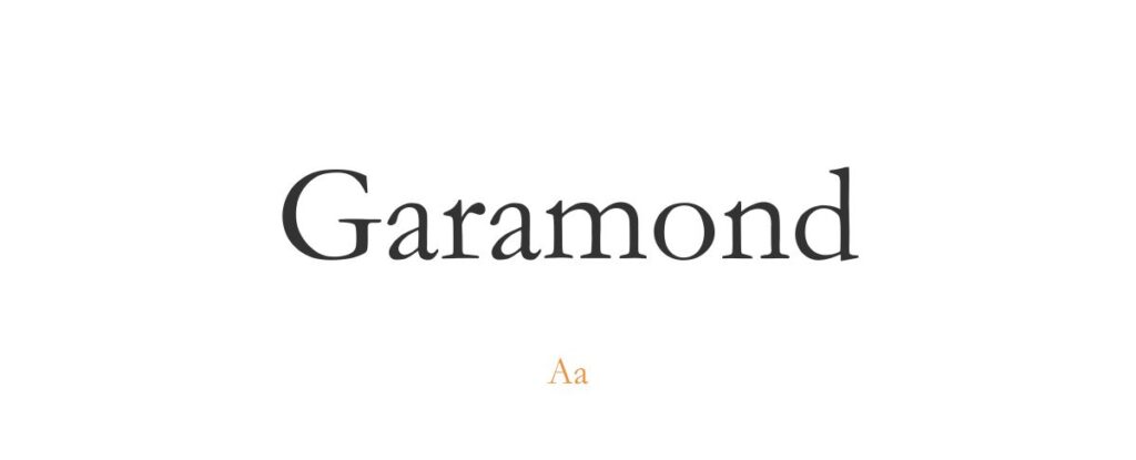
- Free or paid: Free
- About: Ideal for sophisticated and classic designs, offering a timeless elegance with its serif style.

- About: Perfect for impactful, attention-grabbing messages, with its strong, condensed letterforms.
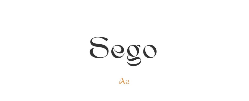
- About: Great for modern, minimalist posters, providing a sleek, contemporary look with its clean lines.

- About: Versatile and clean, suitable for a wide range of poster themes with its geometric sans-serif style.
- About: Excellent for futuristic or minimalist designs, characterized by its geometric shapes and clean appearance.
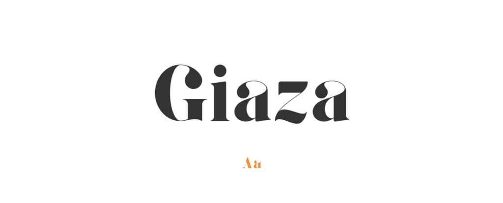
- About: Giaza is stylish and elegant font, ideal for adding a sophisticated touch to any poster.
- Free or paid: Free with Canva Premium
- About: Casual and friendly, perfect for posters with a more informal, approachable vibe.
8. Nectarine
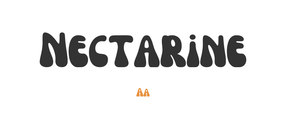
- About: Nectarine is beautiful, playful and quirky font, that is great for lively and fun poster designs.
- About: This font is perfect for posters needing a bold, attention-grabbing, and contemporary look.
10. Vangeda
- About: Vangeda font is suitable for designs that require a modern, sleek, and clean typeface.
11. Shrikhand
- About: With its vibrant and energetic style, Shrikhand is perfect for posters that need to exude boldness, liveliness, and a zest for life.
12. Amatic SC
- About: Informal, hand-drawn, and charming, Amatic SC is great for whimsical, artistic, or casual poster designs, adding a personal, human touch to messages and themes.
13. Brasika
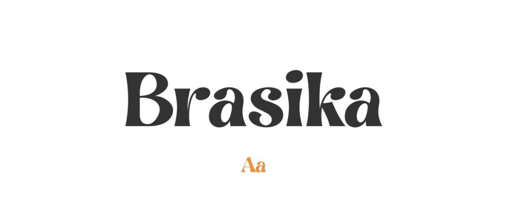
- About: Brasika is suitable for modern, artistic posters, offering a unique flair that is ideal for exhibitions, art shows, or fashion events.
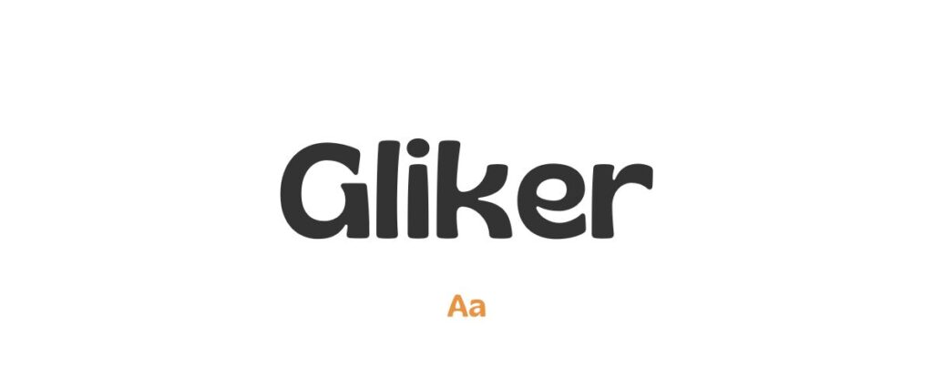
- About: Gliker is ideal for designs that aim to be fun, energetic, and youthful, making it a perfect choice for children’s events or any casual gatherings.
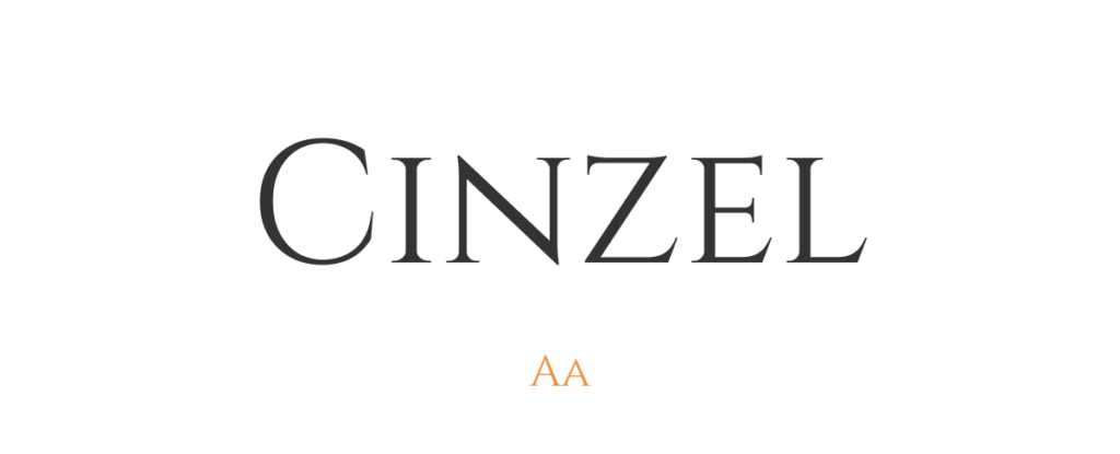
- About: Rooted in history, Cinzel is perfect for traditional themes, offering a sense of heritage and timelessness ideal for cultural, educational, or historical posters.
16. Lucky Bones
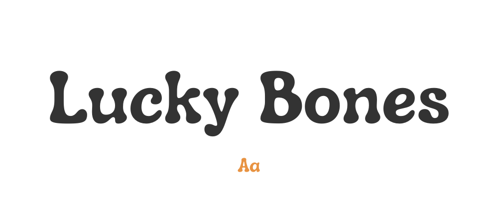
- About: Great for creating a playful, personalized look, ideal for boutique stores, artisanal products, or any poster seeking a hand-made, artisanal feel.

- About: Ideal for whimsical, sentimental, or romantic themes, adding a touch of elegance and personal emotion to wedding posters, poetry events, or boutique advertisements.
18. Gulfs Display
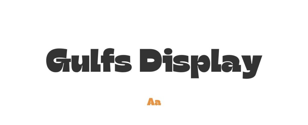
- About: Bold and impactful, Gulfs Display is perfect for making a strong impact in a sophisticated manner, suitable for high-end product launches or corporate events.
19. Dream Avenue
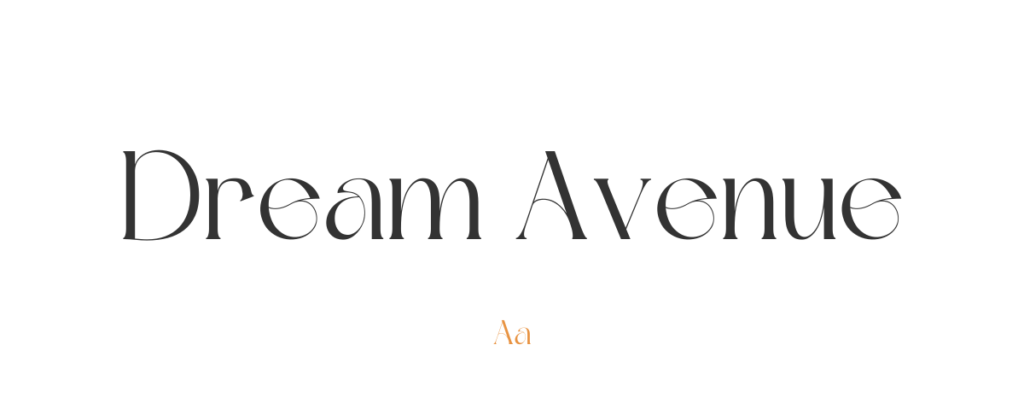
- About: Well-suited for creative and whimsical designs, perfect for art galleries, creative workshops, or any poster that aims to evoke imagination and wonder.
- About: Avatar offres a contemporary, digital feel that is perfect for tech startups, app launches, or any poster that aims to convey innovation and modernity.
21. Komorebi
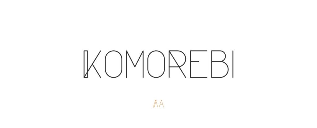
- About: Ideal for designs that require a sophisticated touch, perfect for spa advertisements, wellness retreats, or any poster that seeks to convey tranquility and elegance.
Want more poster fonts for Canva?
If you want to find more fonts and get access to milions of elements for Canva, browse my favorite site: Envato Elements .
They have all kinds of assets such as:
- Fonts (40,000+)
- Stock photos (9,3M+)
- Graphic templates (270,000+)
- Presentation templates (110,000+)
- Stock videos (5,1M+)
- Video templates (96,000+)
- 3D elements (210,000+)
- WordPress assets (6,500+)
- Royalty-free music (140,000+)
How to choose the best Canva fonts for posters?
- Consider the Poster's Theme: The font should align with the overall theme of your poster. For instance, use elegant serif fonts like Garamond for formal events or sleek sans-serif fonts like Gotham for modern designs.
- Legibility is Key: Ensure the font is easy to read from a distance. Fonts like Futura or Sego, with clear and distinct lettering, are great for readability.
- Contrast and Hierarchy: Use contrasting fonts to create a visual hierarchy. Combine a bold font like Impact for headings with a simpler font for body text to draw attention to key areas.
- Audience Appropriateness: Consider who the poster is for. Fonts like Amatic SC might be great for a children’s event, while something like Cinzel may be more suited for a corporate conference.
- Test for Scalability: Some fonts look great at a larger scale but lose clarity when scaled down. Check how your chosen font performs at different sizes, especially if your poster will be printed in various dimensions.
What are Canva fonts for posters usually used for?
- Event Promotion: Eye-catching fonts like Impact are often used to grab attention and promote concerts, festivals, and other events.
- Brand Awareness Campaigns: Fonts like Gotham can be used to maintain brand consistency and professionalism in posters for marketing and advertising campaigns.
- Educational Materials: Clear and readable fonts like Sego are commonly used in educational posters, where information delivery is crucial.
- Artistic and Cultural Exhibitions: Stylish and unique fonts like Giaza or Shrikhand are typically used to add an artistic touch to posters for art shows, gallery openings, and cultural events.
- Personal Use and Decor: People use various Canva fonts to create posters for personal spaces or events like weddings, birthdays, and anniversaries, choosing fonts that add a personal touch like Railey or Lucky Bones.
Diving into Canva's collection to find the best fonts for posters is exciting. It's all about choosing fonts that look good and work well for what you need. Picking the right font can really make your design stand out.
Garamond , Impact , and Sego are my top choices. Garamond is great for a classic look, Impact is perfect for making bold statements, and Sego is ideal for a modern feel. These fonts aren't just about style; they help your poster send the right message. Remember, the best font depends on what you're trying to show. Have fun trying out different fonts, and let them bring your ideas to life. Happy designing – let your posters shine with your personal touch!

Hana Terber
Latest articles on goofy designer.

10 Best After Effects Award Show Templates (My Favorites)
Summary: In this guide, I’ve picked out 10 amazing After Effects templates for award shows that I think will really make your video projects shine.

10 Best After Effects Hud UI Packs (My Favorites)
Summary: In this guide, I’ve meticulously curated a selection of 10 outstanding After Effects HUD UI template packs that I believe will perfectly complement your

10 Best After Effects Action Vfx templates (My Favorites)
Summary: In this guide, I’ve chosen a selection of 10 outstanding After Effects action VFX (visual effects) templates that I believe will perfectly complement your

10 Best After Effects Company Profile Video Templates (My Favorites)
Summary: In this guide, I’ve carefully selected a collection of 10 excellent After Effects company profile video templates that I think are perfect for improving

Stay notified

70+ Best Fonts for Posters 2024
Fonts come in all shapes and sizes, but when it comes to poster design, there are certain types of fonts that can help you make bold statements and attract attention. In this post, we feature some of the best fonts for posters you can use to create the perfect poster design.
It’s quite difficult to generalize poster design. There are just too many types of posters that require various design standards. For example, a poster you design for a business conference and a poster you make for a summer beach party will require completely different designs, including different colors, shapes, layouts, and more importantly, fonts.
When creating this collection of fonts, we decided to cover all categories of poster designs and include both formal and casual fonts you can use to design titles, headers, and text for various types of posters. We’re also featuring a set of tips for choosing a poster font to help get you started.
Hopefully you’ll find the perfect typeface that matches your project!
19+ Million Poster Templates, Flyer Templates, and Design Resources With Unlimited Downloads
Download thousands of stunning poster templates, flyer templates, and more with an Envato membership. It starts at $16 per month, and gives you unlimited access to a growing library of over 19+ million poster designs, flyers, print templates, themes, photos, and more.

Creative Poster design
Illustrator.

Food & Drink Poster

1000 Poster Templates

Abstract Poster Template

Fashion Poster

Music Typography Poster
Explore Poster Templates
Devant Horgen – Modern Poster Font

Devant is a modern decorative font that’s ideal for designing creative poster titles, website headers, banner headings, and much more.
The font comes with a set of beautiful, tall, and slightly rounded set of characters. And it’s available in multiple versions, including OpenType, TrueType, and WebFont versions.
Why This Is A Top Pick
The clean, narrow, and smooth lettering design of this font will ensure your titles are clearly visible even from afar while making your designs look more modern and professional.
Newgate – Classic Poster Font

Newgate is an attractive font that features a beautiful contemporary design that will fit in nicely with various types of business and creative poster designs. Inspired by typography from the 70s, the font comes in 5 different weights and lots of ligatures.
Brimons – Big Poster Font

If you’re looking for a big bold font with thick letters to craft attention-grabbing titles for posters, this is a must-have for you. This font comes with tall and narrow letters that are perfect for poster headings. It includes all-caps letters with a set of small caps characters.
Sysmatic – Soft Condensed Poster Font

Sysmatic is a creative poster font that has a condensed letter design. This font features letters with smooth rounded edges and stylish characters. You can use it to craft big titles and headings for posters, flyers, website headers, and more.
Simple Candy- Trendy Poster Font

This trendy font has the perfect look for designing typography for elegant lifestyle, fashion, and luxury designs. The beautiful serif letters of this font have unique curves that will add a certain classy look to your typography designs.
Coplette – Minimal Poster Font

A clean and minimal font is often the best choice for a poster title. With this font, you can design typography for professional-looking posters with a geometric letter design. The font includes all-caps letters and has multilingual support for 100 languages.
Hazard – Free Marker Poster Font

This is a marker-style font you can use to craft big poster titles for various types of business and entertainment-related designs. The font comes with lots of swashes as a bonus and it’s free to download.
Waldrip – Modern Condensed Poster Font

The big, thick, and condensed design of this font makes it a great choice for crafting big poster titles that can be seen from far away. It features stylishly carved letters with creative strokes. And it will fit perfectly with any type of poster design.
Evaluation – Tall & Narrow Poster Font

Evaluation is another condensed sans serif font featuring a tall and narrow letter design. It also has letters with a clean and modern look. This makes it most suitable for poster designs related to modern brands, agencies, and tech companies.
Glafine – Stylish Font for Posters

Glafine is another stylish poster font you can use to design modern and trendy titles for various types of projects. It has a set of clean characters with creative strokes that give its own personality to every letter.
Silent Phobia – Creative Font for Posters

This font comes with a horror-themed letter design featuring brush-style strokes. It’s designed with Halloween-themed poster and banner designs in mind. But you can use it to craft titles for horror movie posters as well as energetic titles for fitness and gym posters.
Quick Ravage – Free Bold Poster Font

You can download this font for free to craft clean and minimal titles for modern poster designs. The font features uppercase and lowercase characters. And it’s free to use with your personal projects.
Thrive Modern – Sans Serif Poster Font

A chunky poster font for designing big titles and headings. This font has the ideal look that will instantly grab the attention of your title designs. The font includes all-caps letters with international accents.
Feogra – Futuristic Poster Font

If you’re working on a poster design related to modern technologies, this font will fit perfectly with your project. It features a futuristic letter design with a very uncommon vibe. The font includes multilingual support as well.
Marika – Clean Font for Posters

Craft simple, minimal, and clean titles for your modern posters using this sans font. It has a modern letter design with a bold aesthetic feel. It’s the type of font that goes along perfectly with all kinds of poster and flyer designs.
Christmas Theme Font for Posters

It’s never too early to start preparing for Christmas. Grab this font to use in all your Christmas-themed poster and flyer designs. It features a beautiful character design with holiday festive vibes.
Signate Grotesk – Free Poster Font

This font features a stylish letter design with decorative elements along with a Cyrillic character set. It’s ideal for modern and minimal poster designs. And you can use it for free with personal projects.
Fresh Mango – Creative Poster Font

A beautiful retro-style font with a creative and curvy letter design. This font has the perfect look for designing titles and headings for fun and casual posters. It’s especially great for product promotions, packaging designs, and labels.
Jakote – Fun & Quirky Display Font

The simplicity of this font design adds a certain personality to each letter. It’s a fun and casual font made with both kids and grownups in mind. The font comes with uppercase and lowercase letters. You can use it for posters, flyers, book covers, and everything in between.
The Qostter – Retro Serif Poster Font

This is one of the most stylish fonts on our list. It has a unique retro-style serif letter design with beautiful curves. This font is great for designing titles for not just posters but for various other product labels, packaging designs, and even logos. It includes over 700 glyphs, alternate characters, and more.
Miguity – Bold Display Font

Miguity is a bold poster font featuring a classic letter design. Even though it looks like a simple font at first glance, this font packs a lot of additional elements to help you craft unique typography designs. It comes with ligatures, stylistic sets, and multilingual support as well.
Regarn – Free Variable Poster Font

Regarn is a free font you can use to design typography for everything from posters to flyers, social media posts, and more. This font has a set of letters with a mix of retro and modern design elements. It’s free for personal and commercial use.
Begin – Luxury Poster Font

If you’re working on a poster design to promote a luxury brand, jewelry brand, or fashion brand, this font is a great choice for crafting the perfect title for that poster. It has an elegant sans-serif lettering design that will make your poster stand out from the crowd.
Gulam Kingdom – Unique Serif Poster Font

This font is perfect for crafting a poster title that not only attracts attention but also shows off creativity. It features a set of stylish characters that will look great on posters, flyers, banners, and even product labels.
MBF Edge – Futuristic Poster Font

MBD Edge is a modern poster font with a futuristic character design. It has a bold and creative design that’s perfect for tech-themed designs. This font also includes lots of stylish ligatures that you can use to craft monogram logos as well.
Actay – Free Geometric Poster Fonts

Actay is a family of geometric fonts that comes in all kinds of weights and styles. There’s a total of 60 fonts included in this font family. And it’s completely free to use with your personal and commercial projects.
Black Willow – Handbrush Poster Font

Brush-style typography is most suitable for creative poster designs. Use this font to add a bit of creativity to your poster designs. It features a set of handcrafted brush letters with lots of swashes.
MBF Atom – Modern Sans-Serif Poster Font

Atom is an elegant and bold font you can use to craft titles for futuristic event posters or even movie posters. It’s an all-caps font that includes a set of alternative characters that you can enable with capslock.
Grifon – Bold Poster Font

This is a collection of four big and bold fonts made just for crafting titles and headings. You can choose from thin, bold, regular, and black weights to craft titles that fit in well with your overall design.
Blankeny – Vintage Sports Poster Font

Blankeny is a vintage poster font inspired by typography used in sports, especially baseball. This makes it a great font for designing titles for sports-related posters and flyers. As well as logos and badges.
Floreste – Free Elegant Poster Font

Floreste is a free poster font that features a unique vintage letter design. This font is ideal for making stylish titles and headings for both posters and flyers. You can use it for free with personal projects.
Volos – Font For Posters

Check out Volos, a modern and stylish font perfect for posters, flyers, and other branding needs. It comes with a stunning design and a range of features that really should be seen to be appreciated.
Blephyca – Creative Brush Poster Font

If you’re working on a creative poster design, this beautiful font will help create a unique title for your project. It comes with a smooth brush letter design that features both uppercase and lowercase letters. The font is perfect for posters, flyers, and website headers as well.
Andreas – Bold Condensed Poster Font

You can design elegant titles for posters or flyers using this bold poster font. It features a set of unique sans-serif characters with a condensed design. The font includes multilingual support and comes in both TrueType and OpenType formats.
Morish – Handmade Display Font

Serif fonts are now quite popular in website header design as well as in print designs. This is a creative display font you can use to craft titles for your professional projects. The font features a design inspired by the vintage designs from the 1970s.
Chelsy – Fun & Creative Display Font

Make your designs look more fun and entertaining with this quirky poster font. This font is perfect for all kinds of designs for children as well as for fun T-shirt and poster designs. It comes with multilingual support.
Stanley – Free Display Poster Font

This is a free display font you can use in your personal and commercial projects. It comes with a unique letter design that consists of shapes and forms. In addition to posters, you can use the font to design many other digital and print designs.
Vicenza – Elegant Serif Poster Font

This font is perfect for designing posters, banners, flyers, and all kinds of designs for promoting luxury brands. The elegant look and feel of the font give it a certain classy vibe unlike any other font on our list. The font includes lots of glyphs and an italic version as well.
Portway – Military Stencil Poster Font

Portway is a modern stencil poster font that features a letter design inspired by the typography used in military designs. This font works well for designing bold poster titles as well as T-shirt designs and logos.
Huelva – Handwriting Display Font

Huelva is a unique handwriting font you can use to add a creative personality to your designs. The uncommon letter design even makes the font stand out. It includes both uppercase and lowercase letters as well as Webfont versions.
Monstarr – Playful Handmade Poster Font

Designing a poster for children? Then this font is made just for your projects. This playful and adorable font will definitely grab the attention of the kids. It’s perfect for designing flyers, book covers, and banners as well.
Obrazec – Free Industrial Poster Font

Obrazec is a free poster font that comes with a design inspired by industrial designs. It’s an all-caps font that’s most suitable for crafting big and bold titles. You can use it for free with personal and commercial projects.
Burtons – Poster Font

Burton is a stylish font that comes with mixed elements of both retro and modern design. The font’s bold look will allow you to craft eye-catching headlines and titles for posters. It comes with lots of alternate characters, symbols, and ligatures as well.
Lemonade – Poster Font

Lemonade is a creative font with a fresh design. This font will fit in perfectly with your fun, creative, and entertaining poster designs. It will also look great on vintage-themed posters. As a bonus, you’ll also get 5 unique and editable vintage vector badges with this font.
Rhinos Rocks – Brush Font

This font comes with a bold and unique look that makes it ideal for designing posters for movies, rock music events, and many others. It features a hand-brushed design. The font is available in several versions, including all-caps typeface and swashes.
Ironclad – Modern Creative Poster Font

Ironclad is an art deco-style font featuring an elegant design. It’s ideal for making logos, website headers, and titles for luxury and creative branding designs. The font includes multilingual support as well.
Bronxos – Font For Posters

Emulate the classic 90s collaged music posters style with Bronxos, a collage punk font best suited for posters, urban city design, logos, flyers, packaging requirements, you name it. A great font that is sure to impress!
Girock – Quirky Poster Font

Girock is a creative poster font with a fun and quirky design. This font can be used to design all kinds of creative poster designs, flyers, book covers, and much more.
The Ancient – Medieval Sans Typeface

This unique font features a set of medieval-style characters, making it a great font for designing posters for movies, music, and other entertainment-related projects. The font includes both uppercase and lowercase letters.
Bacoter – Free Brush Font

This modern free font comes with a brushstroke design that gives it quite a unique look and feel. The font features a handcrafted design and it’s free to use with your personal projects.
Phenomena – Free Modern Font Family

Phenomena is a complete font family that features 7 different weights you can use to craft both titles and paragraphs. The font features a beautiful rounded character design as well.
Morton – Poster Font

Morton is a modern poster font that is most suitable for designing posters for formal events, such as business conferences, networking events, and exhibitions. The font features a professional design and it comes in 9 different weights.
Reef – Rounded Font

Reef is a casual font featuring an attractive rounded design. You can use this font to craft poster titles as well as paragraph text. The rounded look also makes it ideal for both professional and casual poster designs.
Rogue – Font For Posters

If you are looking for an elegant and trendy font for posters, take a leap of faith in Rogue, a tall letter typeface that will fit right into your needs. A great choice for a wide range of creative and professional applications!
Sallsburgg – Free Font For Posters

Next up is Sallsburgg, a unique and playful outlined font containing the full set of uppercase and lowercase letters, punctuations, numerals, and symbols. The font can be fully customized to your liking.
Hello Miami – Free Font For Posters

Perfect for summer beach party posters, Hello Miami is a creative and stunning font that will draw attention and make people notice your content. It’s free for download, so get your hands on it now.
Helios – Futuristic Font

Helios is a unique sans-serif font with a futuristic space-themed design. It includes all uppercase letters, numbers, and punctuations. The font is also available in rounded and regular versions. It’s perfect for designing technology-related posters.
Clarkson – Script Poster Font

If you’re working on a vintage-themed poster for a special event, holiday promotion, or a business, then this font will come in handy. It comes with a creative design featuring many alternate characters, ligatures, making a total of 550 characters.
The Painter – Vintage Poster Font

The Painter is yet another vintage-themed poster font you can use to design bold titles for posters. It features a design inspired by traditional sign and brush lettering. The font includes a total of 420 characters.
Originals – Poster Font

Originals is a creative font that features a fun and quirky design. The font is available in multiple versions featuring different designs. It’s most suitable for designing posters for school, children, and entertainment events.
Sayfull – Free Bold Sans Serif Font

Sayfull is a bold poster font with a quirky character design. You can use this font to design website headers, poster titles, banners, and much more.
Galaxy – Free Display Font

This creative free font comes with a unique stencil-like character design. It’s most suitable for designing titles for technology and entertainment-themed posters and banner designs.
Crutsen – Poster Font

This font comes with an elegant design that makes it the perfect choice for designing posters for business, branding, and product promotions. It includes lots of stylistic alternate characters, ligatures, and more.
Sunrise Waves – Poster Font

This is a font you can use to design creative posters for holiday-themed events and promotions. It’s a brush font that looks better when used with all-caps. The font is available in both TrueType and OpenType formats.
Monofor – Poster Font

Monofor is a creative font featuring an uncommon design. You can use this font to craft posters for fashion, apparel, travel, and other brand-related events and promotions. It also includes alternate characters and multi-language support.
Rendang – Handmade Font

This font comes with a modern design that makes it perfect for designing titles for travel, business, event, and other promotional posters. It features a handmade script design and comes in TrueType and OpenType formats.
Zeky – Classic Poster Font

Zeky is a modern font with a classic design. It features an elegant formal design that will make your posters stand out from the crowd. This font is most suitable for designing posters for fashion, apparel, and luxury brand promotions.
Tomcat – Free Display Font

Featuring a unique handcrafted design this creative font will help you design more fun titles for posters and banners, especially for projects related to children.
COCO – Free Fashion Typefamily

COCO is an elegant free poster font featuring a design made specifically for luxury brands and agencies. The font comes in 8 weights and features more than 200 glyphs as well.
Castillo – Poster Font

This poster font features a creative design that makes your text look like cave paintings from thousands of years ago. It’s ideal for designing creative and entertaining posters.
Portico Outline – Poster Font

The outline version of the popular Portico font looks perfect for designing technology and business event posters. According to its designer, and from the looks of the previews, the font looks great in neon colors.
Alora – Creative Poster Font

Alora is a modern and creative poster font featuring a quirky design. It’s perfect for promoting special events, holiday-themed promotions, and posters related to kids.
Hennigar – Poster Font

Hennigar is a Neo-Grotesque sans font that features a unique and formal design. You can use it to design posters for formal events, business conferences, and more.
Fort Collins – Font Duo

Fort Collins includes a pair font that seems to go well together, especially if you’re working on a retro-themed poster design. It includes a condensed sans font and a handwriting script font.
Hallowen – Poster Font

This is the perfect font you can use to design attractive and scary-looking posters for Halloween events and promotions. It comes in 6 different styles, including grunge and inline.
Snowy – Winter Floral Color Font

Snowy is a unique font that features a floral design most suitable for winter-themed poster designs. The font has been created using a new font format known as OpenType-SVG. You’ll need Photoshop CC 2017 or Illustrator CC 2018 or better to use this font.
5 Tips for Choosing a Poster Font
Finding the right poster font can be quite challenging since different types of designs require different styles of fonts. These quick tips will help you make the right pick.
1. Go Big and Bold
A fun part of using poster fonts is that you get to go big with your text. When crafting the titles of your posters, website headers, banners, etc, you get to try fonts using large sizes and bold font weights. During these tests, you’ll also notice that not all fonts look great when used in large font sizes.

Thankfully, all of the poster fonts on our list will look great no matter how big you make them out to be. Feel free to experiment with them.
2. Use Themed Fonts
Whether you’re designing a poster for a music festival or for a luxury brand, you should use the fonts that are appropriate for the theme of your poster.

Poster fonts come in various themes ranging from minimal designs to retro styles, brushstroke designs, and more. Pick themed fonts to make your designs look more creative. For example, a brush font is a great choice for designing titles for a rock music poster.
3. Pick the Right Font Pair

When talking about poster fonts we usually only consider the title font, but let’s not forget about the subheadings and body text. Only with the right combination of the title font and paragraph font you can design an effective and impactful poster. Make sure to find a matching font pair for your project.
4. Consider Sans-Serif

Unless you’re designing a poster for a corporate business event or a luxury brand, consider using sans-serif fonts for your poster design. Sans-serif fonts not only improve readability but they also make your poster text and titles clearly visible from a distance.
5. Narrow Fonts Are Better

Narrow and condensed fonts are usually a great choice for designing a poster title. Especially when it’s a long title a narrow font offers a great opportunity to squeeze in more letters without cluttering the design. However, be mindful not to choose a font with too narrow spacing that affects readability.
University Libraries
Creating an academic poster.
- Introduction to Academic Posters
- Fundamentals of Effective Poster Design
- Communicating Technical Data
- Review & Refine
- Finalize & Print
Creating an effective academic poster involves carefully considering several key elements to ensure clear and engaging communication. We focus on these five elements because they are the most significant and easiest to apply when designing an academic poster.
Clear Layout and Organization
How can you arrange your content to ensure the information flows logically and is easy to follow?
Organize your content in a clear, logical order.
Group related information together.
Use clear and distinct headings to separate different sections and guide the viewer through your poster.
Use numbering or arrows if linked content should be read in a particular order.
Utilize white space and ensure all elements are well-aligned and balanced to avoid clutter and enhance readability.
Concise and Informative Content
What are the most critical points of your research that must be included to convey your main message effectively?
Focus on the main points of your research, ensuring the essential information is easy to find and understand.
Combine text and visuals to convey your message effectively. Use bullet points or short sentences instead of long paragraphs.
Strike a balance by avoiding oversimplification (too little useful information) and overcomplication (too much information).
Ensure that the content is presented clearly and simply to enhance comprehension.
Effective Use of Visuals
How can you use diagrams, graphs, or flowcharts to simplify and visually convey complex information in your poster?
Use diagrams, graphs, or flowcharts to visually explain complex information.
Ensure every graphic has a clear purpose.
Identify a focal point to draw viewers in, whether it's a key diagram, flowchart, or a clear main title.
Ensure all images and graphics are high-resolution (at least 300 dpi) to avoid pixelation when printed.
Make sure all visuals are well-labeled and include legends where necessary to facilitate easy interpretation of the data.
Readable Typography
How will you choose and maintain consistent, clear fonts to ensure your poster is easily readable from different distances?
To ensure legibility at a distance, use around 70-100 pts for the main title, 40 pts for subheadings, and 24 pts for body text.
Aim for a word count between 300 to 800 words. 300 words allows for more graphics, while 800 words results in a text-heavy poster.
Keep it simple with no more than two fonts—typically one for titles and one for body text.
Choose clear, legible fonts and maintain consistency throughout the poster. Sans-serif fonts like Arial or Helvetica are often preferred for readability.
Thoughtful Use of Color
How will you select a visually appealing and consistent color scheme to highlight important information and create visual interest?
Ensure there is sufficient contrast between the background and text to enhance readability.
Limit the number of different colors; a simple color palette can be very effective.
Avoid unnecessary and distracting background textures or decorations.
Examples of Posters Using the Elements of Poster Design

Free Editable Poster presentation Examples | EDrawMax Online . (n.d.). Edrawsoft. https://www.edrawmax.com/article/poster-presentation-examples.html

Shearer, D. (2022, April 14). How to make a conference poster | Postgraduate life at Surrey . https://blogs.surrey.ac.uk/postgraduate-student-experience/2022/04/14/how-to-make-a-conference-poster/
- << Previous: Design
- Next: Communicating Technical Data >>
- Last Updated: Aug 17, 2024 10:54 AM
- URL: https://guides.library.unt.edu/academicposter
Additional Links
UNT: Apply now UNT: Schedule a tour UNT: Get more info about the University of North Texas
UNT: Disclaimer | UNT: AA/EOE/ADA | UNT: Privacy | UNT: Electronic Accessibility | UNT: Required Links | UNT: UNT Home
By Matt Moran November 12, 2021
31 Best Fonts for Posters (Free & Premium)
Looking for a bold and visually interesting font to make your posters pop?
Finding fonts for posters can be difficult, as there are many to choose from, and it’s important to find a font that is readable and stylish.
Thankfully, we’ve done the hard work for you and scoured the web for some truly unique and stylish poster fonts.
Keep reading to check out our list of the 31 best fonts for posters. We’ve included both free and premium fonts, so there’s something for everyone’s budget.
What To Look For in a Poster Font
When it comes to designing posters it’s important that your designs are attractive, eye-catching, and easy to read. Therefore, it’s a good idea to choose a bold and clear font that is easily readable from a distance.
Not only that, but the font you choose should be in keeping with the overall aesthetic of your poster.
In addition to this, you should try and choose a font that is readable in both small and large font sizes. That way, you can use it for heading, and smaller bodies of text on your poster.
31 Best Fonts for Posters
Now you know a little more about choosing the perfect font for posters, let’s jump into the list, starting with our top pick…
1. Cheddar Gothic – Our Top Pick

Cheddar Gothic is a simple and bold font family that is perfect for use on posters. The font family includes Sans, Serif, Slab, and Stencil versions of the font as well as extras.
Why it’s our top pick
Cheddar Gothic is a great font for posters, as it is simple, easy to read, and impactful. With the Cheddar Font Family, you can create a variety of designs for different purposes, which is why it’s our overall favorite.
Price: Personal and commercial use Included with Envato Element subscription ($16.50/month)
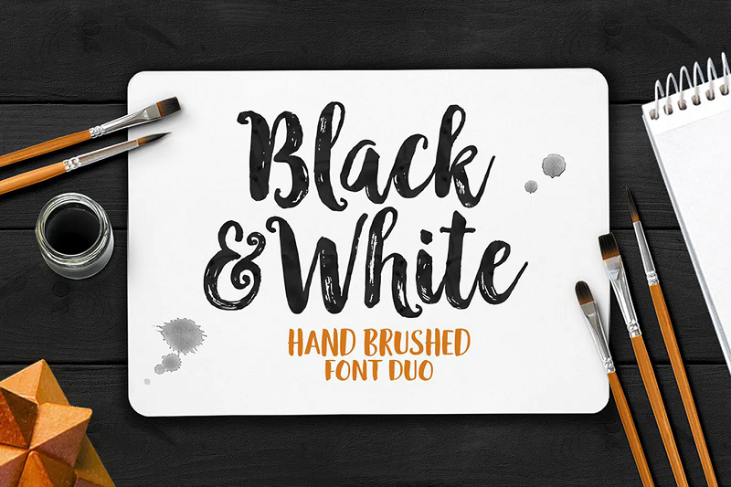
2. Black and White Typeface
Black and White typeface is an elegant brush font that would look great on a stylish poster. Sometimes, brush fonts can be difficult to read, but Black and White Typeface is bold and easy to read whilst still having a feminine hand-drawn feel.

If you’re looking for a bold and chunky font for posters, Spot is a great option. This unique and modern all-caps font really jumps off the page making it perfect for poster headers. The font download includes 4 versions of the font; Regular, Italic, Outline, and Outline Italic.
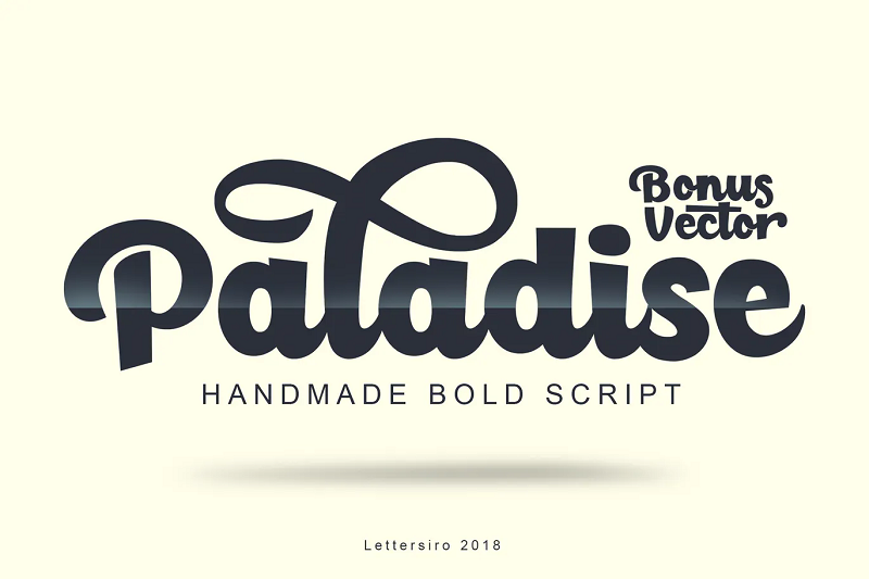
4. Paladise Bold Script
Paladise is a handmade bold script that would look great on posters and promotions. The font comes complete with stylish alternate characters, ligatures, and more so that you can mix and match to create interesting and unique designs.
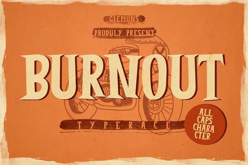
5. Burnout Font
Burnout is a unique display font with a vintage feel. Whether you’re making posters for a birthday party or family-friendly event, this font is sure to make your designs stand out. The download includes all caps characters, as well as numbers and punctuation.
6. Lovile Type
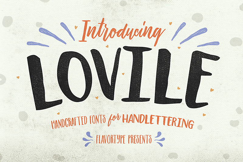
Lovile is a 3 font family that is great for creating varied and unique poster designs. The family includes condensed, bold, and script-style fonts that can be used for headers and smaller bodies of poster text. This fun and feminine font family would look great on promotional posters or as part of festive designs.
7. Boulden Typeface

Boulden is a vintage-inspired all-caps font that is sure to grab the reader’s attention. The font is reminiscent of old propaganda posters and would be perfect as a header font for posters. The font download included three styles; Regular clean, Grunge, and Shadow.
8. Rhinos Rocks Brush Font
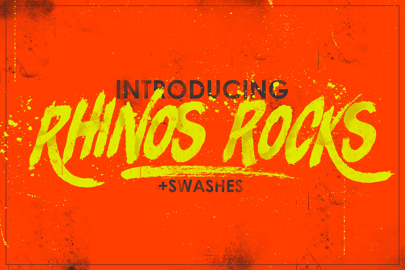
Rhinos Rocks is a fun brush-style font with a masculine feel. Despite being a tilted brush font, Rhinos Rocks is still easy to read and stylish. This font would be great for posters, as the downloaded also includes stylistic swashes that can add some extra visual interest to your designs.
9. Maxwell Sans
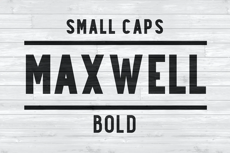
Maxwell is a simple, yet extremely impactful font inspired by 1950’s posters. It’s suitable for use as a headline font, or paragraph text as it is highly readable, making it perfect for posters. The font download includes 5 different font weights and a range of stylistic alternates.
10. Sonder Regular

Sonder Regular is a super trendy poster font with a bohemian feel. This stunning font would look great on posters for fashion stores and cafes. The font download comes with 5 different weights, plus some logo templates and bonus illustrations.
Price: Free for personal and desktop commercial use
11. Hunky Dory

Hunky Dory is a fun and playful display font that would be perfect for child-friendly posters designs. It’s a bold display typeface that is easy to read and eyecatching.
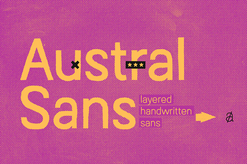
12. Austral Sans
Austral Sans is a super trendy and modern typeface perfect for creating unique and alternative poster designs. The font comes in 3 weights and the download includes a selection of ligatures and stylistic alternates. Whether you’re creating posters for a trendy event or a concert this font would work perfectly.
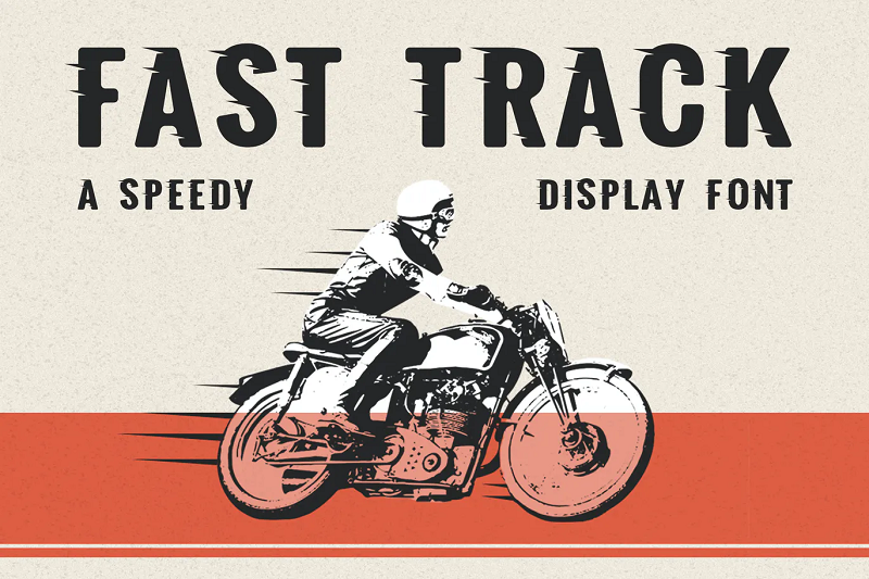
13. Fast Track Display Font
Fast Track is an interesting display font that is designed to create a feeling of speed. The bold and impactful font would work well on posters for automotive or racing events. It would also look great on posters for automotive-themed birthday parties for children.
14. Vintage Ink
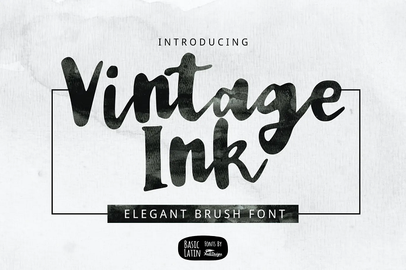
Vintage Ink is an elegant brush font that’s sure to spruce up any poster design. The font is sophisticated and highly readable and would be perfect for events like weddings and parties.
15. Burtons Poster Font
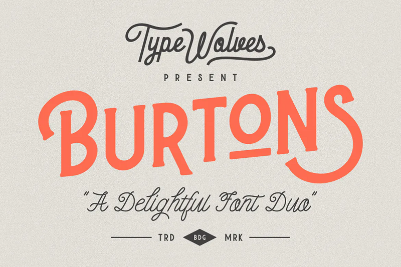
Burtons is a stylish font duo that would be perfect for creating retro-themed posters. The font duo includes a bold uppercase font that would work great for headlines and a stylish calligraphy font that would be perfect for subheadings and smaller bodies of text.
16. Toboggan Utility Display Typeface
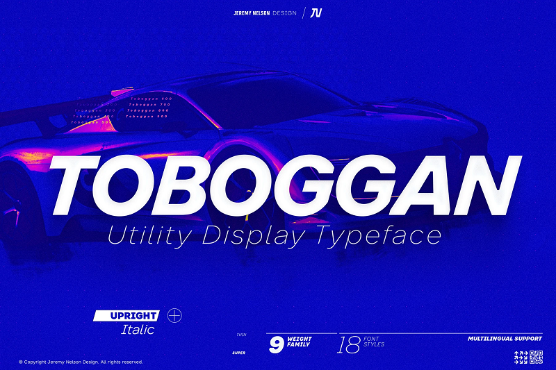
Toboggan is a bold utility typeface that would work well on informational posters. The font is extremely readable and stands out well, so it would be perfect for creating attention-grabbing poster headlines. The font download includes nine weight options and extensive numeral sets.
17. Frank Poster Font

Frank is a classic bold typeface that is perfect for creating eye-catching poster headers. The font pack includes 5 weights and 4 styles, so you can easily use the same font for both headers and paragraph text within your poster designs.
18. Knuckle Sandwich
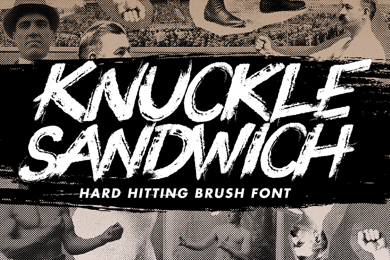
Knuckle Sandwich is a bold and daring brush font inspired by graffiti. This font is extremely bold and visually interesting and perfect for creating modern and trendy posters. The font comes with over 300 glyphs and additional swashes.
19. Brother Typeface

Brother Typeface is a super cool display font that is great for creating modern and stylish posters. The font download includes both light and bold versions of the font so it can be used for a variety of text types within your designs.
20. Jack Reacher Typeface
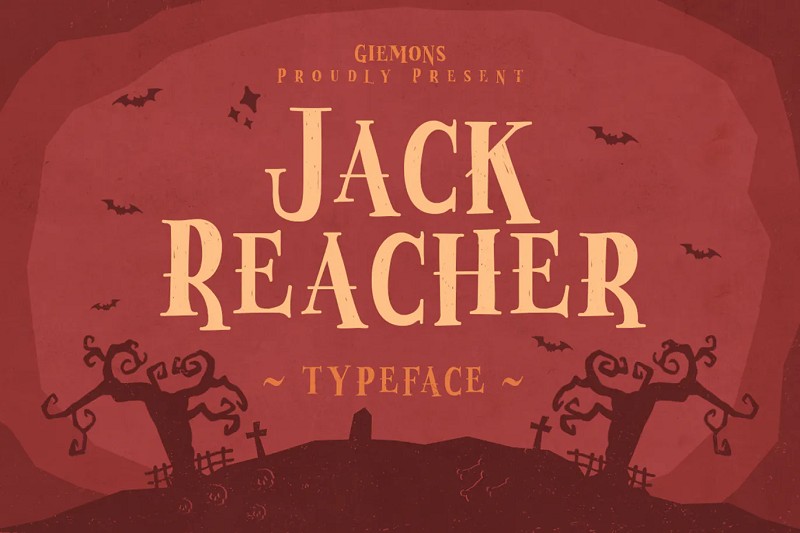
Jack Reacher is the perfect poster font for the spooky season. The font is bold and easy to read and will add a touch of spookiness to your designs. This font would be perfect on posters for Halloween events and parties.
21. Gunnar Typeface
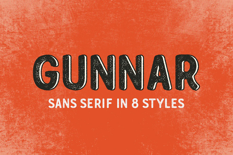
Gunnar is an attractive rounded display font that would be perfect for professional and informational posters. The font is clear and easy to read but will give your posters a friendly feel. The font download includes 8 different styles; Regular, Print, Outline-Rough, Cutout-Rough, Outline-Cutout, Cutout, Outline, and Rough.
22. Blocklyn Font Family

Blocklyn is a big and bold font family that is perfect for making a statement. This heavy and masculine font will help you create impactful and eye-catching posters. The font family includes four fonts; Condensed, Condensed Italic, Grunge, and Grunge Italic.
23. Sunrise Waves
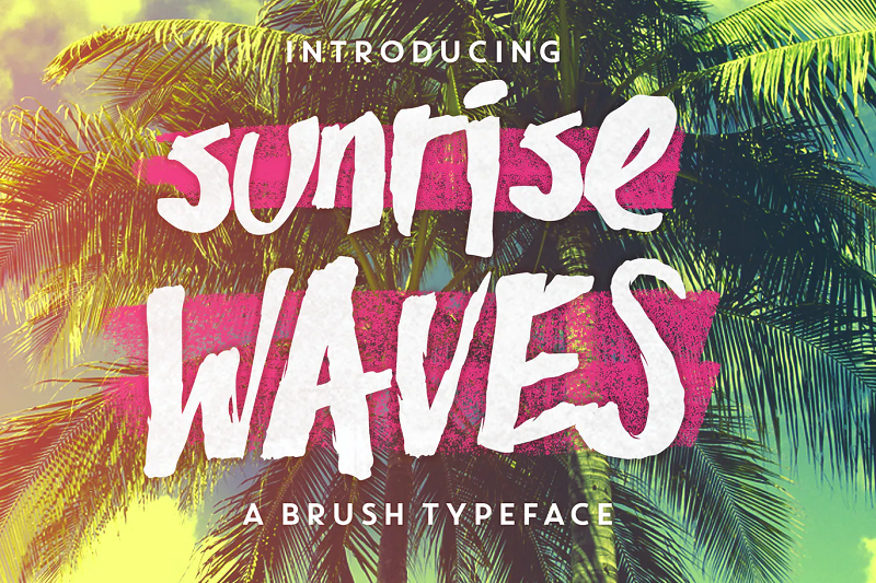
If you’re looking for a font that will give your designs a vacation vibe, then Sunrise Waves is a perfect choice. This stylish brush font is the perfect header font for posters and is sure to make your designs more eye-catching and attractive.
24. Hitchcut Font
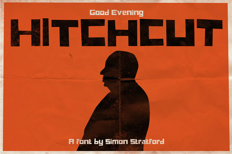
Hitchcut is a truly unique display font inspired by movie posters from old Alfred Hitchcock movies. This simple, yet eye-catching typeface would be perfect for movie posters, promotional signage, and more.
25. Lunchbox Slab Ornaments
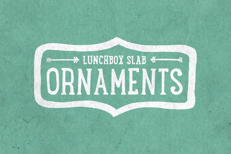
Lunchbox Slab Ornaments is an elegant handwritten font that would look great on wedding or party posters and invitations. It has a fun and whimsical feel. The font download includes light, regular and bold styles making it perfect for headers and smaller poster text.
26. Originals Typeface

Originals typeface is a playful hand-drawn font that would work perfectly for event posters and even birthday party invitations. The quirky font is truly unique and is sure to catch the eye of passers-by.
27. Slivky Rounded San Serif Font
Slivky is a rounded sans serif font that is perfect for use in modern and minimalist designs. The bold version of this font would work great for poster headers. In addition, the Slivky light would be great as a font for smaller texts, as it’s clean and highly readable.
Price: Free for personal and commercial use
28. CA Negroni
CA Negroni is a trendy inline font that is great for creating bold posters. The font has a retro feel and is reminiscent of old Italian advertisements. It would look great on posters for trendy restaurants and cocktail bars.
29. Visby San Serif Font
Visby is the perfect font for creating professional posters for businesses and offices. This no-nonsense san serif font is minimalist and super easy to read. The font could easily be used as a header font but would be perfect for smaller text too.
30. Siggy Typeface Family

Siggy is a super bold typeface family perfect for creating fun and engaging posters. This font would look great on sale posters and in retail stores. The font download comes complete with four different font styles.
31. Senlità Retro Display Font

Senilità is a blocky bold font that is perfect for poster headers. The retro font is inspired by mid-century Italian films and art-deco designs. The font comes complete with a range of custom ligatures.
Related Posts
Reader interactions, droppin' design bombs every week 5,751 subscriber so far.
You have successfully joined our subscriber list.
Leave a Reply Cancel reply
Your email address will not be published. Required fields are marked *
Notify me of followup comments via e-mail. You can also subscribe without commenting.
Home Blog Design How to Design a Winning Poster Presentation: Quick Guide with Examples & Templates
How to Design a Winning Poster Presentation: Quick Guide with Examples & Templates

How are research posters like High School science fair projects? Quite similar, in fact.
Both are visual representations of a research project shared with peers, colleagues and academic faculty. But there’s a big difference: it’s all in professionalism and attention to detail. You can be sure that the students that thrived in science fairs are now creating fantastic research posters, but what is that extra element most people miss when designing a poster presentation?
This guide will teach tips and tricks for creating poster presentations for conferences, symposia, and more. Learn in-depth poster structure and design techniques to help create academic posters that have a lasting impact.
Let’s get started.
Table of Contents
- What is a Research Poster?
Why are Poster Presentations important?
Overall dimensions and orientation, separation into columns and sections, scientific, academic, or something else, a handout with supplemental and contact information, cohesiveness, design and readability, storytelling.
- Font Characteristics
- Color Pairing
- Data Visualization Dimensions
- Alignment, Margins, and White Space
Scientific/Academic Conference Poster Presentation
Digital research poster presentations, slidemodel poster presentation templates, how to make a research poster presentation step-by-step, considerations for printing poster presentations, how to present a research poster presentation, final words, what is a research poster .
Research posters are visual overviews of the most relevant information extracted from a research paper or analysis. They are essential communication formats for sharing findings with peers and interested people in the field. Research posters can also effectively present material for other areas besides the sciences and STEM—for example, business and law.
You’ll be creating research posters regularly as an academic researcher, scientist, or grad student. You’ll have to present them at numerous functions and events. For example:
- Conference presentations
- Informational events
- Community centers
The research poster presentation is a comprehensive way to share data, information, and research results. Before the pandemic, the majority of research events were in person. During lockdown and beyond, virtual conferences and summits became the norm. Many researchers now create poster presentations that work in printed and digital formats.

Let’s look at why it’s crucial to spend time creating poster presentations for your research projects, research, analysis, and study papers.

Research posters represent you and your sponsor’s research
Research papers and accompanying poster presentations are potent tools for representation and communication in your field of study. Well-performing poster presentations help scientists, researchers, and analysts grow their careers through grants and sponsorships.
When presenting a poster presentation for a sponsored research project, you’re representing the company that sponsored you. Your professionalism, demeanor, and capacity for creating impactful poster presentations call attention to other interested sponsors, spreading your impact in the field.
Research posters demonstrate expertise and growth
Presenting research posters at conferences, summits, and graduate grading events shows your expertise and knowledge in your field of study. The way your poster presentation looks and delivers, plus your performance while presenting the work, is judged by your viewers regardless of whether it’s an officially judged panel.
Recurring visitors to research conferences and symposia will see you and your poster presentations evolve. Improve your impact by creating a great poster presentation every time by paying attention to detail in the poster design and in your oral presentation. Practice your public speaking skills alongside the design techniques for even more impact.
Poster presentations create and maintain collaborations
Every time you participate in a research poster conference, you create meaningful connections with people in your field, industry or community. Not only do research posters showcase information about current data in different areas, but they also bring people together with similar interests. Countless collaboration projects between different research teams started after discussing poster details during coffee breaks.
An effective research poster template deepens your peer’s understanding of a topic by highlighting research, data, and conclusions. This information can help other researchers and analysts with their work. As a research poster presenter, you’re given the opportunity for both teaching and learning while sharing ideas with peers and colleagues.
Anatomy of a Winning Poster Presentation
Do you want your research poster to perform well? Following the standard layout and adding a few personal touches will help attendees know how to read your poster and get the most out of your information.

The overall size of your research poster ultimately depends on the dimensions of the provided space at the conference or research poster gallery. The poster orientation can be horizontal or vertical, with horizontal being the most common. In general, research posters measure 48 x 36 inches or are an A0 paper size.
A virtual poster can be the same proportions as the printed research poster, but you have more leeway regarding the dimensions. Virtual research posters should fit on a screen with no need to scroll, with 1080p resolution as a standard these days. A horizontal presentation size is ideal for that.
A research poster presentation has a standard layout of 2–5 columns with 2–3 sections each. Typical structures say to separate the content into four sections; 1. A horizontal header 2. Introduction column, 3. Research/Work/Data column, and 4. Conclusion column. Each unit includes topics that relate to your poster’s objective. Here’s a generalized outline for a poster presentation:
- Condensed Abstract
- Objectives/Purpose
- Methodology
- Recommendations
- Implications
- Acknowledgments
- Contact Information
The overview content you include in the units depends on your poster presentations’ theme, topic, industry, or field of research. A scientific or academic poster will include sections like hypothesis, methodology, and materials. A marketing analysis poster will include performance metrics and competitor analysis results.
There’s no way a poster can hold all the information included in your research paper or analysis report. The poster is an overview that invites the audience to want to find out more. That’s where supplement material comes in. Create a printed PDF handout or card with a QR code (created using a QR code generator ). Send the audience to the best online location for reading or downloading the complete paper.
What Makes a Poster Presentation Good and Effective?
For your poster presentation to be effective and well-received, it needs to cover all the bases and be inviting to find out more. Stick to the standard layout suggestions and give it a unique look and feel. We’ve put together some of the most critical research poster-creation tips in the list below. Your poster presentation will perform as long as you check all the boxes.
The information you choose to include in the sections of your poster presentation needs to be cohesive. Train your editing eye and do a few revisions before presenting. The best way to look at it is to think of The Big Picture. Don’t get stuck on the details; your attendees won’t always know the background behind your research topic or why it’s important.
Be cohesive in how you word the titles, the length of the sections, the highlighting of the most important data, and how your oral presentation complements the printed—or virtual—poster.
The most important characteristic of your poster presentation is its readability and clarity. You need a poster presentation with a balanced design that’s easy to read at a distance of 1.5 meters or 4 feet. The font size and spacing must be clear and neat. All the content must suggest a visual flow for the viewer to follow.
That said, you don’t need to be a designer to add something special to your poster presentation. Once you have the standard—and recognized—columns and sections, add your special touch. These can be anything from colorful boxes for the section titles to an interesting but subtle background, images that catch the eye, and charts that inspire a more extended look.
Storytelling is a presenting technique involving writing techniques to make information flow. Firstly, storytelling helps give your poster presentation a great introduction and an impactful conclusion.
Think of storytelling as the invitation to listen or read more, as the glue that connects sections, making them flow from one to another. Storytelling is using stories in the oral presentation, for example, what your lab partner said when you discovered something interesting. If it makes your audience smile and nod, you’ve hit the mark. Storytelling is like giving a research presentation a dose of your personality, and it can help turning your data into opening stories .
Design Tips For Creating an Effective Research Poster Presentation
The section above briefly mentioned how important design is to your poster presentation’s effectiveness. We’ll look deeper into what you need to know when designing a poster presentation.
1. Font Characteristics
The typeface and size you choose are of great importance. Not only does the text need to be readable from two meters away, but it also needs to look and sit well on the poster. Stay away from calligraphic script typefaces, novelty typefaces, or typefaces with uniquely shaped letters.
Stick to the classics like a sans serif Helvetica, Lato, Open Sans, or Verdana. Avoid serif typefaces as they can be difficult to read from far away. Here are some standard text sizes to have on hand.
- Title: 85 pt
- Authors: 65 pt
- Headings: 36 pt
- Body Text: 24 pt
- Captions: 18 pt

If you feel too prone to use serif typefaces, work with a font pairing tool that helps you find a suitable solution – and intend those serif fonts for heading sections only. As a rule, never use more than 3 different typefaces in your design. To make it more dynamic, you can work with the same font using light, bold, and italic weights to put emphasis on the required areas.
2. Color Pairing
Using colors in your poster presentation design is a great way to grab the viewer’s attention. A color’s purpose is to help the viewer follow the data flow in your presentation, not distract. Don’t let the color take more importance than the information on your poster.

Choose one main color for the title and headlines and a similar color for the data visualizations. If you want to use more than one color, don’t create too much contrast between them. Try different tonalities of the same color and keep things balanced visually. Your color palette should have at most one main color and two accent colors.
Black text over a white background is standard practice for printed poster presentations, but for virtual presentations, try a very light gray instead of white and a very dark gray instead of black. Additionally, use variations of light color backgrounds and dark color text. Make sure it’s easy to read from two meters away or on a screen, depending on the context. We recommend ditching full white or full black tone usage as it hurts eyesight in the long term due to its intense contrast difference with the light ambiance.
3. Data Visualization Dimensions
Just like the text, your charts, graphs, and data visualizations must be easy to read and understand. Generally, if a person is interested in your research and has already read some of the text from two meters away, they’ll come closer to look at the charts and graphs.

Fit data visualizations inside columns or let them span over two columns. Remove any unnecessary borders, lines, or labels to make them easier to read at a glance. Use a flat design without shadows or 3D characteristics. The text in legends and captions should stay within the chart size and not overflow into the margins. Use a unified text size of 18px for all your data visualizations.
4. Alignment, Margins, and White Space
Finally, the last design tip for creating an impressive and memorable poster presentation is to be mindful of the layout’s alignment, margins, and white space. Create text boxes to help keep everything aligned. They allow you to resize, adapt, and align the content along a margin or grid.
Take advantage of the white space created by borders and margins between sections. Don’t crowd them with a busy background or unattractive color.

Calculate margins considering a print format. It is a good practice in case the poster presentation ends up becoming in physical format, as you won’t need to downscale your entire design (affecting text readability in the process) to preserve information.
There are different tools that you can use to make a poster presentation. Presenters who are familiar with Microsoft Office prefer to use PowerPoint. You can learn how to make a poster in PowerPoint here.
Poster Presentation Examples
Before you start creating a poster presentation, look at some examples of real research posters. Get inspired and get creative.
Research poster presentations printed and mounted on a board look like the one in the image below. The presenter stands to the side, ready to share the information with visitors as they walk up to the panels.

With more and more conferences staying virtual or hybrid, the digital poster presentation is here to stay. Take a look at examples from a poster session at the OHSU School of Medicine .
Use SlideModel templates to help you create a winning poster presentation with PowerPoint and Google Slides. These poster PPT templates will get you off on the right foot. Mix and match tables and data visualizations from other poster slide templates to create your ideal layout according to the standard guidelines.
If you need a quick method to create a presentation deck to talk about your research poster at conferences, check out our Slides AI presentation maker. A tool in which you add the topic, curate the outline, select a design, and let AI do the work for you.
1. One-pager Scientific Poster Template for PowerPoint
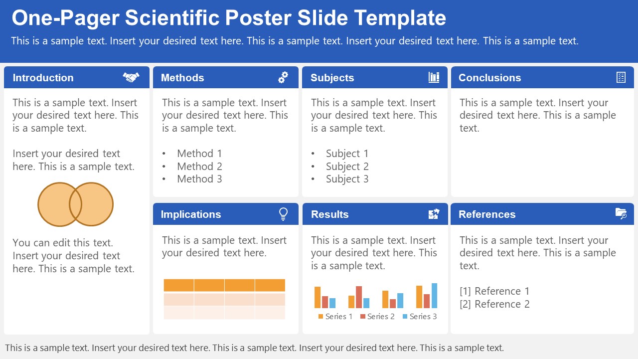
A PowerPoint template tailored to make your poster presentations an easy-to-craft process. Meet our One-Pager Scientific Poster Slide Template, entirely editable to your preferences and with ample room to accommodate graphs, data charts, and much more.
Use This Template
2. Eisenhower Matrix Slides Template for PowerPoint
An Eisenhower Matrix is a powerful tool to represent priorities, classifying work according to urgency and importance. Presenters can use this 2×2 matrix in poster presentations to expose the effort required for the research process, as it also helps to communicate strategy planning.
3. OSMG Framework PowerPoint Template
Finally, we recommend presenters check our OSMG Framework PowerPoint template, as it is an ideal tool for representing a business plan: its goals, strategies, and measures for success. Expose complex processes in a simplified manner by adding this template to your poster presentation.
Remember these three words when making your research poster presentation: develop, design, and present. These are the three main actions toward a successful poster presentation.

The section below will take you on a step-by-step journey to create your next poster presentation.
Step 1: Define the purpose and audience of your poster presentation
Before making a poster presentation design, you’ll need to plan first. Here are some questions to answer at this point:
- Are they in your field?
- Do they know about your research topic?
- What can they get from your research?
- Will you print it?
- Is it for a virtual conference?
Step 2: Make an outline
With a clear purpose and strategy, it’s time to collect the most important information from your research paper, analysis, or documentation. Make a content dump and then select the most interesting information. Use the content to draft an outline.
Outlines help formulate the overall structure better than going straight into designing the poster. Mimic the standard poster structure in your outline using section headlines as separators. Go further and separate the content into the columns they’ll be placed in.
Step 3: Write the content
Write or rewrite the content for the sections in your poster presentation. Use the text in your research paper as a base, but summarize it to be more succinct in what you share.
Don’t forget to write a catchy title that presents the problem and your findings in a clear way. Likewise, craft the headlines for the sections in a similar tone as the title, creating consistency in the message. Include subtle transitions between sections to help follow the flow of information in order.
Avoid copying/pasting entire sections of the research paper on which the poster is based. Opt for the storytelling approach, so the delivered message results are interesting for your audience.
Step 4: Put it all together visually
This entire guide on how to design a research poster presentation is the perfect resource to help you with this step. Follow all the tips and guidelines and have an unforgettable poster presentation.
Moving on, here’s how to design a research poster presentation with PowerPoint Templates . Open a new project and size it to the standard 48 x 36 inches. Using the outline, map out the sections on the empty canvas. Add a text box for each title, headline, and body text. Piece by piece, add the content into their corresponding text box.

Transform the text information visually, make bullet points, and place the content in tables and timelines. Make your text visual to avoid chunky text blocks that no one will have time to read. Make sure all text sizes are coherent for all headings, body texts, image captions, etc. Double-check for spacing and text box formatting.
Next, add or create data visualizations, images, or diagrams. Align everything into columns and sections, making sure there’s no overflow. Add captions and legends to the visualizations, and check the color contrast with colleagues and friends. Ask for feedback and progress to the last step.
Step 5: Last touches
Time to check the final touches on your poster presentation design. Here’s a checklist to help finalize your research poster before sending it to printers or the virtual summit rep.
- Check the resolution of all visual elements in your poster design. Zoom to 100 or 200% to see if the images pixelate. Avoid this problem by using vector design elements and high-resolution images.
- Ensure that charts and graphs are easy to read and don’t look crowded.
- Analyze the visual hierarchy. Is there a visual flow through the title, introduction, data, and conclusion?
- Take a step back and check if it’s legible from a distance. Is there enough white space for the content to breathe?
- Does the design look inviting and interesting?
An often neglected topic arises when we need to print our designs for any exhibition purpose. Since A0 is a hard-to-manage format for most printers, these poster presentations result in heftier charges for the user. Instead, you can opt to work your design in two A1 sheets, which also becomes more manageable for transportation. Create seamless borders for the section on which the poster sheets should meet, or work with a white background.
Paper weight options should be over 200 gsm to avoid unwanted damage during the printing process due to heavy ink usage. If possible, laminate your print or stick it to photographic paper – this shall protect your work from spills.
Finally, always run a test print. Gray tints may not be printed as clearly as you see them on screen (this is due to the RGB to CMYK conversion process). Other differences can be appreciated when working with ink jet plotters vs. laser printers. Give yourself enough room to maneuver last-minute design changes.
Presenting a research poster is a big step in the poster presentation cycle. Your poster presentation might or might not be judged by faculty or peers. But knowing what judges look for will help you prepare for the design and oral presentation, regardless of whether you receive a grade for your work or if it’s business related. Likewise, the same principles apply when presenting at an in-person or virtual summit.
The opening statement
Part of presenting a research poster is welcoming the viewer to your small personal area in the sea of poster presentations. You’ll need an opening statement to pitch your research poster and get the viewers’ attention.
Draft a 2 to 3-sentence pitch that covers the most important points:
- What the research is
- Why was it conducted
- What the results say
From that opening statement, you’re ready to continue with the oral presentation for the benefit of your attendees.
The oral presentation
During the oral presentation, share the information on the poster while conversing with the interested public. Practice many times before the event. Structure the oral presentation as conversation points, and use the poster’s visual flow as support. Make eye contact with your audience as you speak, but don’t make them uncomfortable.
Pro Tip: In a conference or summit, if people show up to your poster area after you’ve started presenting it to another group, finish and then address the new visitors.
QA Sessions
When you’ve finished the oral presentation, offer the audience a chance to ask questions. You can tell them before starting the presentation that you’ll be holding a QA session at the end. Doing so will prevent interruptions as you’re speaking.
If presenting to one or two people, be flexible and answer questions as you review all the sections on your poster.
Supplemental Material
If your audience is interested in learning more, you can offer another content type, further imprinting the information in their minds. Some ideas include; printed copies of your research paper, links to a website, a digital experience of your poster, a thesis PDF, or data spreadsheets.
Your audience will want to contact you for further conversations; include contact details in your supplemental material. If you don’t offer anything else, at least have business cards.
Even though conferences have changed, the research poster’s importance hasn’t diminished. Now, instead of simply creating a printed poster presentation, you can also make it for digital platforms. The final output will depend on the conference and its requirements.
This guide covered all the essential information you need to know for creating impactful poster presentations, from design, structure and layout tips to oral presentation techniques to engage your audience better .
Before your next poster session, bookmark and review this guide to help you design a winning poster presentation every time.
Like this article? Please share
Cool Presentation Ideas, Design, Design Inspiration Filed under Design
Related Articles

Filed under Google Slides Tutorials • August 20th, 2024
How to Insert an Emoji in Google Slides
Add a creative touch to your slides by learning how to insert an emoji in Google Slides. Step-by-step instructions and third-party extensions list.

Filed under Design • August 14th, 2024
Creating Custom Themes for PowerPoint and Google Slides
Do you want your slides to go beyond the average result from a template? If so, learn how to create custom themes for presentations with this guide.

Filed under Google Slides Tutorials • August 13th, 2024
How to Curve Text in Google Slides
Despite Google Slides not offering a native tool for this, there are multiple ways to curve text in Google Slides. Check them out here!
Leave a Reply
👀 Turn any prompt into captivating visuals in seconds with our AI-powered design generator ✨ Try Piktochart AI!
14 Fonts That Make Your PowerPoint Presentations Stand Out

Presentation fonts, more generally known as typography , are one of the most neglected areas of presentation design .
That’s because when presentation fonts are used appropriately and correctly, they blend so well with the overall design that your audience doesn’t even notice it. Yet, when your font usage is lacking, this sticks out like a sore thumb.
Over 30 million PowerPoint presentations are made daily. Therefore, when it comes to creating your own slide decks, you need to take every advantage you can get to make it stand out. Among other design choices, choosing the best fonts for presentations can provide a huge impact with minimal effort.
In fact, it’s one of the reasons why Steve Jobs was able to turn Apple into the brand it is today. His expertise in branding and design was fueled by the Calligraphy classes that he attended in his early years. This allowed him to find the best font family that accentuated his company’s brand and identity.
So no matter the subject of your PowerPoint presentation, the best font or font family will help you create a lasting impression and convey a powerful message. To help you shine through your next slideshow, here’s our cultivated list of the best fonts for presentations.
If you want to create a PowerPoint presentation but don’t have access to PowerPoint itself, you can use Piktochart’s presentation maker to create a presentation or slide deck and export it as a .ppt file.
Best Fonts for Presentations and PowerPoint
Before we proceed, you should know some basics of typography, especially the difference between Serif, Sans Serif, Script, and Decorative types of fonts.
Serif Fonts
These are classic fonts recognizable by an additional foot (or tail) where each letter ends. Well-known Serif fonts include:
- Times New Roman
- Century
Sans Serif Fonts
Differing from the Serif font style, Sans Serif fonts do not have a tail. The most popular Sans Serif font used in presentations is Arial, but other commonly employed renditions of Sans Serif typeface include:
- Century Gothic
- Lucida Sans
Script and Decorative Fonts
These are the fonts that emulate handwriting—not typed with a keyboard or typewriter. Script typefaces and decorative or custom fonts for PowerPoint vary immensely and can be created by a graphic designer to ensure these custom fonts are bespoke to your company/brand.
With these font fundamentals explained, you can also keep up-to-date with the popularity of such fonts using Google’s free font analytics tool here . Let’s now go ahead with our list of the best presentation fonts for your PowerPoint slides.
- Libre-Baskerville
Keep in mind that you don’t have to stick with only a single font for your slides. You could choose two of the best fonts for your presentation, one for your headings and another for the copy in the body of the slides.
Without further ado, let’s dive into the 14 best presentation fonts.
1. Helvetica

Helvetica is a basic Sans Serif font with a loyal user base. Originally created in 1957 , Helvetica comes from the Latin word for ‘Switzerland’ where it was born. When you use Helvetica, the top-half part of the text is bigger than in other Sans Serif fonts. For this reason, letters and numbers have a balanced proportionality between the top and bottom segments. As a result, this standard font makes it easier to identify characters from a distance.
As a result of being one of the easiest typecases to read compared to different presentation fonts, Helvetica is great for communicating major points as titles and subheadings in a Microsoft PowerPoint presentation.
For these reasons, Helvetica is a popular choice for anyone creating posters .
If you are presenting live to a large group of people, Helvetica is your new go-to font! The classic Sans Serif font is tried and tested and ensures the legibility of your slide deck, even for the audience members sitting at the very back. Though it looks good in any form, you can make Helvetica shine even more in a bold font style or all caps.

Futura is one of the popular Sans Serif fonts and is based on geometric shapes. Its features are based on uncomplicated shapes like circles, triangles, and rectangles. In other words , it mimics clean and precise proportions instead of replicating organic script or handwriting. Futura is a great default font for presentations because of its excellent readability, elegance, and lively personality.
As one of many standard fonts designed to invoke a sense of efficiency and progress, Futura is best employed when you want to project a modern look and feel in your presentation. Futura is a versatile option ideal for use in both titles and body content, accounting for why it has remained immensely popular since 1927.
3. Rockwell

The Rockwell font has strong yet warm characters that make it suitable for a variety of presentation types, regardless of whether it’s used in headings or the body text. However, best practice dictates that this standard font should be used in headers and subheadings based on its geometric style. Rockwell is a Geometric Slab Serif , otherwise known as a slab serif font alternative. It is formed almost completely of straight lines, flawless circles, and sharp angles. This Roman font features a tall x-height and even stroke width that provides its strong presence with a somewhat blocky feel.
Monoline and geometric, Rockwell is a beautiful font that can display any text in a way that looks impactful and important. Whether you want to set a mood or announce a critical update or event, you can’t go wrong with this robust font.

Verdana is easily a great choice as one of the top PowerPoint presentation fonts. Its tall lowercase letters and wide spaces contribute significantly towards boosting slide readability even when the text case or font size is small. That’s why Verdana is best for references, citations, footnotes, disclaimers, and so on. Additionally, it can also be used as a body font to extrapolate on slide headings to nail down your key points.
Besides that, it is one of the most widely available fonts, compatible with both Mac and Windows systems. This makes this modern Sans Serif font a safe bet for when you are not certain where and how will you be delivering your presentation.

Raleway is a modern and lightweight Sans Serif font. Its italicized version has shoulders and bowls in some letters that are a bit off-centered. What this means is that the markings excluding the stem are intentionally lower or higher as compared to other fonts.
This gives Raleway a slightly artistic look and feels without impacting its readability (and without falling into the custom or decorative fonts category). In fact, many professionals think the swashes and markings actually enhance the font’s readability and legibility. Moreover, Raleway also has a bold version which is heavily used in presentations and slide decks.
The bottom line is that Raleway is a versatile typeface that can be used in a variety of presentations, either in the body copy or in titles and subheadings. When the titles are capitalized or formatted as bold, captivating your audience becomes a breeze.
6. Montserrat

Montserrat is one of our favorite PowerPoint fonts for presentation titles and subheadings. The modern serif font is bold, professional, and visually appealing for when you want your headers and titles to really capture the audience’s attention.
Every time you move to the next slide, the viewers will see the headings and instantly understand its core message.
Another major quality of the Montserrat font is its adaptability and versatility. Even a small change, such as switching up the weight, gives you an entirely different-looking typeface. So you get enough flexibility to be able to use the font in all types of PowerPoint presentations.
Montserrat pairs nicely with a wide range of other fonts. For example, using it with a thin Sans Serif in body paragraphs creates a beautiful contrast in your PowerPoint slides. For this reason, it is usually the first modern Serif font choice of those creating a business plan or marketing presentation in MS PowerPoint.

Roboto is a simple sans-serif font that is a good fit for PowerPoint presentations in a wide range of industries. Well-designed and professional, Roboto works especially well when used for body text, making your paragraphs easy to read.
Roboto combines beautifully with several other fonts. When you’re using Roboto for body text, you can have headings and titles that use a script font such as Pacifico, a serif font such as Garamond, or a Sans Serif font such as Gill Sans.

Bentham is a radiant serif font perfectly suited for headings and subtitles in your PowerPoint slides. It gives your presentation a traditional appearance, and its letter spacing makes your content really easy to read.
You can use this font in uppercase, lowercase, or title case, depending on how it blends with the rest of your slide. For best results, we recommend combining Bentham with a Sans Serif font in your body content. For example, you can use a font such as Open Sans or Futura for the rest of your slide content.
9. Libre-Baskerville

Libre-Baskerville is a free serif Google font. You can pair this classic font with several other fonts to make a PowerPoint presentation with a traditional design.
One of its best features is that it works equally well in both headings and body copy. It’s clear and easily readable, no matter how you use it. And when used for headings, it works really well in uppercase form.

Tahoma is one of the fonts that offer the best level of clarity for PowerPoint slides. It has easily distinguishable characters like Verdana, but with the exception of tight spacing to give a more formal appearance.
Designed particularly for screens, Tahoma looks readable on a variety of screen sizes and multiple devices. In fact, this significant aspect is what makes Tahoma stand out from other fonts in the Sans Serif family.
11. Poppins

Poppins falls within the Sans Serif font category but is a different font of its own uniqueness. The solid vertical terminals make it look strong and authoritative. That’s why it’s great for catchy titles and subheadings, as well as for the body paragraphs. Poppins is a geometric typeface issued by Indian Type Foundry in 2014. It was released as open-source and is available in many font sizes for free on Google Fonts.
When you want something that feels casual and professional in equal measure, pick Poppins should be in the running for the best PowerPoint fonts.
12. Gill Sans

Gill Sans is another classic presentation font for when you’re looking to build rapport with your audience. Gill Sans is a friendly and warm Sans Serif font similar to Helvetica. At the same time, it looks strong and professional.
It’s designed to be easy to read even when used in small sizes or viewed from afar. For this reason, it’s a superior match for headers, and one of the best PowerPoint fonts, especially when combined with body text using Times New Roman or Georgia (not to mention several other fonts you can pair it with for successful results). This is the right font for combing different fonts within a presentation.
13. Palatino

Palatino can be classified as one of the oldest fonts inspired by calligraphic works of the 1940s. This old-style serif typeface was designed by Hermann Zapf and originally released in 1948 by the Linotype foundry. It features smooth lines and spacious counters, giving it an air of elegance and class.
Palatino was designed to be used for headlines in print media and advertising that need to be viewable from a distance. This attribute makes Palatino a great font suitable for today’s PowerPoint presentations.
Palatino is also a viable choice for your presentation’s body text. It’s a little different from fonts typically used for body paragraphs. So it can make your presentation content stand out from those using conventional fonts.
14. Georgia

Georgia typeface has a modern design that few fonts can match for its graceful look. It’s similar to Times New Roman but with slightly larger characters. Even in small font size, Georgia exudes a sense of friendliness; a sense of intimacy many would claim has been eroded from Times New Roman through its overuse. This versatile font was designed by Matthew Carter , who has successfully composed such a typeface family which incorporates high legibility with personality and charisma. Its strokes form Serif characters with ample spacing, making it easily readable even in small sizes and low-resolution screens.
Another benefit of using this modern font is its enhanced visibility, even when it’s used in the background of your PowerPoint slides. Moreover, the tall lowercase letters contribute to a classic appearance great for any PowerPoint presentation.
Final Step: Choosing Your Best Font for Presentations
Choosing the right PowerPoint fonts for your future presentations is more of a creative exercise than a scientific one. Unless you need to abide by strict branding guidelines and company policies, there are no rules for the ‘best font’ set in stone. Plus, presentation fonts depend entirely on the environment or audience it is intended for, the nature and format of the project, and the topic of your PowerPoint presentation.
However, there are certain basic principles rooted in typography that can help you narrow down the evergrowing list of available PowerPoint presentation fonts and choose PowerPoint fonts that will resonate with and have a powerful impact on your target audience.
As discussed in this article, these include font factors such as compatibility with most systems, clarity from a distance, letter spacing, and so on. Luckily for you, our carefully researched and compiled list of best fonts for presentations above was created with these core fundamentals already in mind, saving you time and hassle.
As long as you adopt these best practices for standard fonts without overcomplicating your key message and takeaways, you’ll soon be on your way to designing a brilliant slide deck using a quality PowerPoint font or font family! From all of us here at Piktochart, good luck with your new and improved presentation slides that will surely shine!

Other Posts
What Color is Vermilion? Its Meaning, Code & Combinations
What Color is Amaranth? Its Meaning, Code & Combinations
What Color is Gamboge? Its Meaning, Code & Combinations
- Color Palettes
- Baseball Team Colors
- NHL Team Colors
- Superhero Fonts
- Gaming Fonts
- Brand Fonts
- Fonts from Movies
- Similar Fonts
- What’s That Font
- Photoshop Resources
- Slide Templates
- Fast Food Logos
- Superhero logos
- Tech company logos
- Shoe Brand Logos
- Motorcycle Logos
- Grocery Store Logos
- Pharmaceutical Logos
- Graphic Design Basics
- Beer Brand Ads
- Car Brand Ads
- Fashion Brand Ads
- Fast Food Brand Ads
- Shoe Brand Ads
- Tech Company Ads
- Motion graphics
- Infographics
- Design Roles
- Tools and apps
- CSS & HTML
- Program interfaces
- Drawing tutorials

Cincinnati Reds Colors – Hex, RGB,

The Wolverhampton Wanderers Logo History, Colors,

What is Kerning in Typography: Detailed

New York Mets Colors – Hex,
Design Your Way is a brand owned by SBC Design Net SRL Str. Caminului 30, Bl D3, Sc A Bucharest, Romania Registration number RO32743054 But you’ll also find us on Blvd. Ion Mihalache 15-17 at Mindspace Victoriei
The 33 Best Fonts for PowerPoint Presentations
- BY Bogdan Sandu
- 7 February 2024
Picture this: You’ve crafted the most compelling PowerPoint, your content’s pure gold. But wait, does your font scream snooze fest or radiate confidence? That’s where I step in .
Slide design isn’t just about pretty visuals; it’s the fine print too. Think about it, the legibility , typography , and sans-serif charm that could make or break your presentation. We’re diving into a world where Arial isn’t the alpha, and Calibri has companions.
By the end of this deep-dive, you’ll be armed with examples of the best fonts for PowerPoint presentations . Fonts that won’t just hold your audience’s gaze but glue it to the screen.
From PowerPoint font styles to mastering the visual hierarchy in slides , I’ve got your back. We’re talking readability , professionalism, and those oh-so-subtle nuances of typeface selection .
Ready to transform your text from meh to magnificent ? Let’s turn that tide with typeface.
Top Fonts for PowerPoint Presentations
| Times New Roman | Serif | High | Formal, Academic | Classic, widely used, can appear outdated |
| Garamond | Old-style Serif | High | Professional, Print | Elegant, smaller than other fonts at the same size |
| Georgia | Serif | High | Electronic screens | Designed for clarity on digital screens |
| Palatino | Serif | High | Formal, Creative | Roman typeface, large |
| Baskerville | Transitional Serif | High | Formal, Print | Serious and professional |
| Cormorant | Serif | Moderate | Artistic, Display | High contrast, decorative |
| Playfair Display | Serif | Moderate | Headings, Display | High contrast, distinctive style |
| Libre Baskerville | Serif | High | Web, Readability | Optimized for body text on the web |
| Arial | Sans-serif | High | General use | Ubiquitous, often considered a web-safe font |
| Helvetica | Sans-serif | High | Branding, Professional | Highly popular, neutral design |
| Calibri | Humanist Sans-serif | High | General, Business | Default PowerPoint font since 2007 |
| Tahoma | Sans-serif | High | On-screen Readability | Clear at small sizes |
| Verdana | Sans-serif | High | Web, Digital displays | Wide spacing, good for legibility at small sizes |
| Roboto | Sans-serif | High | Web, Mobile apps | Google’s Android system font, modern |
| Lato | Sans-serif | High | Web, Corporate | Friendly and professional nature |
| Open Sans | Humanist Sans-serif | High | Web, Print | Clean and neutral, good for web and mobile interfaces |
| Montserrat | Geometric Sans-serif | High | Headings, Web design | Modern, geometric style |
| Proxima Nova | Sans-serif | High | Web, Interfaces | Combines a geometric look with modern proportions |
| Futura | Geometric Sans-serif | Moderate | Branding, Decorative | Strong, geometric design |
| Raleway | Sans-serif | High | Print, Web | Elegant and clean, good for headers and body text |
| Segoe UI | Humanist Sans-serif | High | User Interfaces, Digital | Default font for Microsoft products |
| Noto Sans | Sans-serif | High | Multilingual content | Designed for a harmonious look across multiple languages |
| Franklin Gothic | Sans-serif | High | Newspapers, Advertising | Sturdy and robust, good for headlines |
| Impact | Sans-serif | Moderate | Headlines, Posters | Narrow and tightly spaced, for short and bold statements |
| Comic Sans | Script | Low | Casual, Informal | Friendly, but often perceived as unprofessional |
| Lobster | Script | Moderate | Decorative, Headings | Flamboyant and attention-grabbing |
| Papyrus | Display | Low | Thematic, Decorative | Often considered overused and inappropriately applied |
| Bradley Hand | Script/Handwriting | Moderate | Casual, Personal projects | Imitates handwriting, less formal |
| Abril Fatface | Display | Moderate | Headlines, Advertising | High contrast, large headlines |
| Dosis | Sans-serif | High | Modern, Friendly presentations | Soft edges, a rounded and legible typeface |
| KoHo | Sans-serif | High | Print, Web | Low-contrast and legible at small sizes |
| DM Serif Display | Serif | Moderate | Headlines, Display | High-contrast, distinctive for large formats |
| Heebo | Sans-serif | High | Web, Hebrew language content | An extension of Roboto for Hebrew scripts |
Serif Fonts
Serif fonts are the old souls of typography. They’re classic, elegant, and have a touch of sophistication. Think of them like a fine wine – they just make everything look more refined.
Times New Roman

The Bauhaus Influence: A New Era in Graphic Design
The husqvarna logo history, colors, font, and meaning.

You may also like

Ad Impact: The 19 Best Fonts for Advertising
- Bogdan Sandu
- 20 December 2023

T-Shirt Typography: 30 Best Fonts for T-Shirts
- 21 December 2023

15 Best Poster Fonts to Make Big Impact on Your Design
You often see posters with pliable text, which effectively conveys emotion. That’s because typefaces that provide large openings and negative space can bring a big impact on your design.
Whether you are creating your own poster, flyer, or other print materials, using the correct font is critical if you want your work to be noticed.
Posters are big mediums when you want to publicize something or raise awareness. If a poster is designed well, it can make a massive difference. Poster fonts are tools that help in designing attractive posters.
Studying, testing, and analyzing the perfect poster font is a very important aspect for designers. Good fonts can result in a great poster.
We’ve gathered 15 of the best poster fonts to make a huge difference in your poster design.
Table of Contents
What is a Poster Font?
A poster font is a typeface with thick strokes and sharp edges. It’s often used on posters or signs to make them stand out from the rest of the text on a page.
In the past, many poster fonts were created by hand in order to make them look more like handwriting. Today, there are digital versions that make it much easier for designers to create these types of fonts quickly and easily.
Poster fonts are useful for creating advertisements and marketing materials for businesses, especially those in the entertainment industry.
The large size of the font makes it easy to read from a distance, which is particularly beneficial if you’re advertising your company at an event or festival.
How to choose the right font for your poster design?
The font you choose for your poster design is arguably the most important choice you’ll make in the process.
The font that you select will help to establish the tone and feel of your poster, and will also determine how easily your audience can read it.
The first thing to consider when choosing a font for your poster is how legible it is. If you choose a font that is too small or too hard to read, then your audience may have difficulty reading all of the information on the poster and may not be able to take away everything that you intended them to learn from it.
Another thing to keep in mind when choosing fonts for posters is whether or not they are available in different weights or styles.
If you want to create a bold statement with your poster design, then using a bolder weight might be appropriate; however, if you want something more subtle and understated, then using a lighter weight might better suit your needs.
Best Poster Fonts

Beetels is a playful and strong font created by Typefactory. The Beetels font works great on print, with its clear-to-read and bold characters.
Beetels is a modern and type-driven font. It was created with the purpose of being easily read, understood, and loved by many.
Professional, playful, and strongly modulated. Four versions are available.
2. WinterLand Font
Winterland font is a display typeface with 2 different styles, regular and slant.
It’s perfect for posters, logos, magazines, book covers, banners, T-shirts and headers, or even large-scale artwork.
It’s a great choice if you want to stand out in the crowd and create something remarkable and memorable.
Winterland contains all the characters and alternate letters you need to create original, professional works. It includes support for ligatures and multilingual accents.
You may also like our post on Top 15 Minimal and Clean Fonts to Save the World of Design
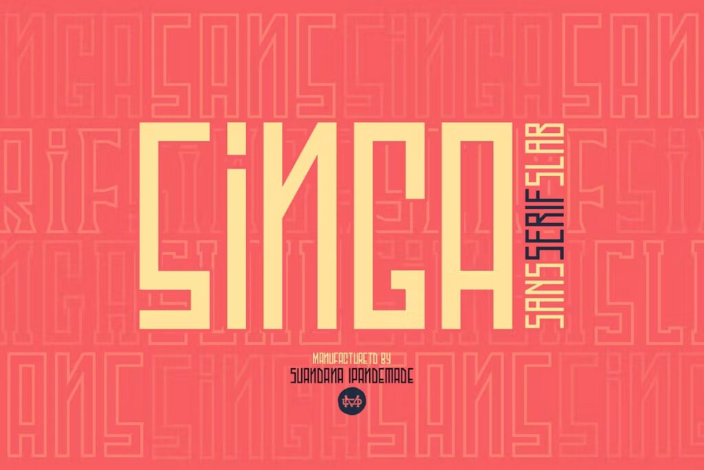
Singa is a three-weight classic casual font family that gives amazing results in all types of posters.
It can be used for any branding, product packaging, invitation, quotes, t-shirt design, label design, poster design, logo design, and more.
Singa comes with an Extended character set, Multilingual support, Stylistic Alternates, and other Open Type features that can be accessed by using programs such as Illustrator, InDesign, or CorelDRAW.
4. Wavetone
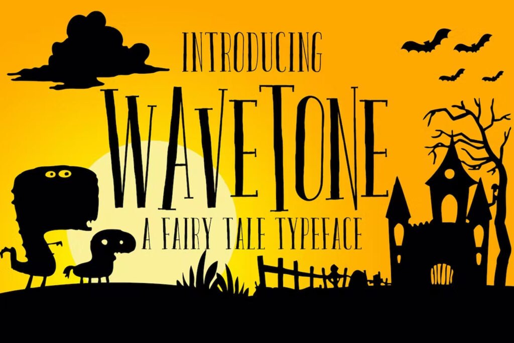
Wavetone is a display typeface inspired by classic advertisements and movie posters. It’s also suitable for other purposes, such as headlines, insignia, badges, invitations, greeting cards, and more.
The vintage feel of Wavetone is combined with OpenType features to make it easy to create attractive messages in your designs.
Wavetone was created to evoke a sense of nostalgia and to capture the feeling of old movie posters, and advertisements of another era.
The hand-drawn details of this font will add a warm, personal touch to any message you wish to convey.

Biogem is a multi-purpose and versatile display typeface that includes 18 fonts in plain and italic styles.
It has 9 weights ranging from thin to black 90 alternative characters, 4 catchwords, and a large variety of ornaments and symbols.
Biogem is a clever and versatile typeface with a strong personality, ideal for display purposes. It’s great for branding, ads, film titles, and posters.
A bold and playful design, it can be used for branding, film titles, packaging, advertising, and posters, as well as web or app design.
6. Special Ramen
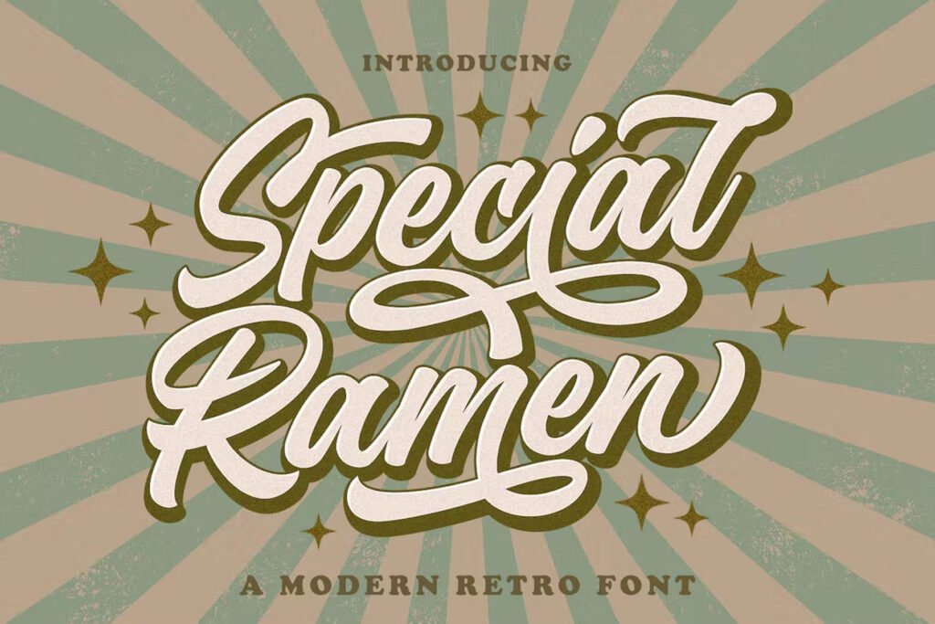
Special Ramen Font is an urban retro typeface with the style of logotype lettering. It was created to help you create a logotype or lettering style for your brand or client.
Ramen Font is the quintessential urban retro voice. It’s inspired by the city of Tokyo and its cryptic culture, which is reflected in this typeface design.
You can also use it for designing all kinds of graphic stuff such as weddings, fashion, invitations, t-shirts, websites, businesses, quotes, headline fonts, branding, advertising, signature, social media, and various print and digital media with a stylish touch.
Check out our trending article Difference Between Font and Typeface (The Ultimate Guide)
7. Noir Pro
Noir is a sans serif font family of 12 fonts, ranging from light and elegant weights perfect for a small text to extremely heavy and masculine weights suited for large display sizes.
Noir is a collection of versatile fonts that can be used together or separately. It looks great in print, on mobile devices, and everywhere else.
It has been designed with contemporary aesthetics heavily influenced by early 20th-century geometric typefaces while maintaining its geometric structure; it carries an organic personality with a touch of warmth injected into each form.
It has a rich arsenal of Open Type features for highly professional use and extended Latin, Cyrillic, and Greek language support.
8. Denominary
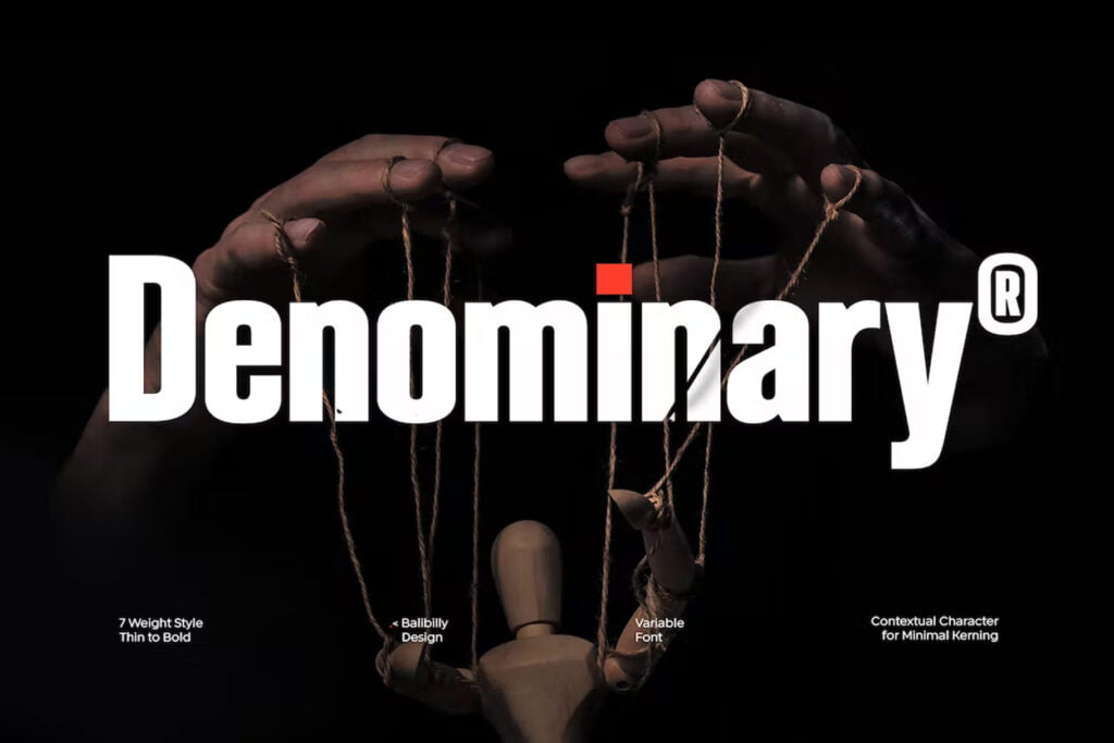
The Denominary typeface has an advanced feature that sets it apart from others: auto-active contextual alternates.
Contextual alternates will push your typography project to a balanced form, whether you’re designing a logo or branding package.
Designed to be practical, Denominary is a display font family with contextual alternates. It’s a typeface that offers a natural voice, and fluid and legible letterforms in a stylish way.
They designed the letterform by considering the white space and contrast to get a natural voice and fluid–and of course, this will happen in a legible and stylish way.
9. Blockhead
Blockhead is a robust slab serif font, designed to draw attention and highlight any project.
Blockhead is a powerful, industrial-inspired slab serif font with an accessible touch. It has three weights and extensive Latin support.
Its geometric structure and sharp edges give it an industrial feel that can be softened by the thin, rounded slab serifs on certain letterforms, giving it a modern touch as well.
This typeface has three weights, each with 252 glyphs (uppercase and lowercase) and extensive Latin script support.
Blockhead is perfect for bold headlines and logos as well as short text blocks where you want to add emphasis.
10. Fusterd

Check out Fusterd Font, a fun and imperfect modern brushed script font with a touch of uniqueness driven. Use it to design wedding invitations, street ads, Instagram posts, t-shirt designs, branding, and more.
Fusterd Font is a type family inspired by brush lettering and cool styles, with a light-hearted look but still within the boundaries of being a highly usable and functional font.
It will come with alternate characters, including initial and terminal letters, ligatures, number alternates, and so on.
Fusterd Font is a modern doodle font, be ready for your next design with this typeface.
Also read, 7 Essential Elements of Typography Every Designer Must Know About
11. Kuileru

Kuileru Font is a modern and authentic font. Perfect for both the professional and branding needs of a product.
The font itself is modern and professional, with a classic feel. As it’s made up of only uppercase letters and numbers, it gives a more informal look than the lowercase letters of a traditional font.
This font is suitable for any branding project like quotes, logos, blog headers, posters, banding, letter, invitation, stationery, etc…
Designed as versatile and flexible that can be used on a range of projects and mediums. outstanding in a wide range of contexts.
12. STENCILAND

STENCILAND is a stylized typeface that is perfect for use in logos and other branding projects.
It is a smart font that helps you create in-depth designs by making simple cuts. Create alluring messages that will leave an impression wherever you use them!
This font is also well-suited for use in movie posters and banners to get mind-blowing results. Try it out and see how easy it is to get a professional-looking result in no time!
13. Jawoni Blew
Jawoni Blew Font is a modern, authentic font that’s perfect for both professional and branding needs. This font works great for any branding project like quotes, logos, blog headers, and posters.
It can also be used on band names, lettering, invitations, stationery, etc. Designed as a versatile and flexible typeface that can be used on a range of projects and mediums with outstanding results.
It is perfect for adding a touch of personality to your design projects. Use it to add some vintage character to your text or create something really unique with the alternate glyphs.
14. Hothead Western

HOTHEAD, an upper and lowercase serif font inspired by western American culture. This font is traditional yet modern, still having a strong, western vintage touch.
It has a wide range of character support, including numerals and punctuation marks, as well as upper and lowercase letters. This versatile font can be used in creating eye-catching logos, headers, posters, and packaging designs.
HOTHEAD has 258 glyphs (including characters A-Z, numerals, and punctuation), extensive Latin script language support, and was carefully designed to be versatile: it allows you to create bold logos, headers, posters, and stand-out packaging designs.

Yafeu Sans Serif Font Family is a luxurious and fashionable sans-serif typeface that looks stunning in every context.
A stylish and fashionable type of family, Yafeu Sans Serif can be used for wedding invitations, books, and magazines. The font is also ideal for poster designs.
It contains 2 weights, which makes it perfect for magazine headlines, logos, invitations, texts, presentations, posters, notices, titles, and other types of branding material.
Yafeu Sans Serif font has a strong geometric structure yet it does not look mechanical. It embodies sophisticated elegance, drawing inspiration from the stylish packaging of premium brands.
Choosing the right font can radically affect how your poster is perceived by its intended audience. If you want to make a statement that screams, “I put a lot of time and effort into this,” then structured and condensed font families will do the trick.
But if you’re looking for something a little more laidback, almost handwritten and casual, consider picking up a font from the display or script family. You may even choose to go with both for maximum effect!
Recommended reading: 15+ Best Signature Fonts for a Professional Touch (2023)
What is the easiest font to read on a poster?
The easiest font to read on a poster is one that is bold, but not too bold. The best fonts are clear and easy to read from a distance.
How to choose the right poster?
If you’re looking to print a poster, there are a few things you need to know. First, make sure the paper is thick enough to handle the ink and moisture. Second, make sure it’s not too flimsy that it’s likely to tear or fall apart easily. Third, look for smooth surfaces that will allow for easy application of the ink.
What is the most popular font style?
The most popular font style is serif. Serif fonts are characterized by small lines at the end of each character, which can make them more legible than sans-serif fonts, which don’t have this feature.
Does the selection of fonts affect the design of a poster?
Yes, the selection of fonts affects the design of a poster. The selection of fonts for your poster should be based on the type of poster that you are designing. Fonts can help make your poster more visually appealing, but they can also detract from your message if used incorrectly.
4 thoughts on “15 Best Poster Fonts to Make Big Impact on Your Design”
- Pingback: Top 10 Most Popular Fonts for Websites (2023)
- Pingback: The 15 Stunning Fonts for YouTube Thumbnail Design
- Pingback: 12+ Best Fonts For Stunning Logo Design
- Pingback: 15+ Best Adventure Fonts for Stunning Designs
Leave a Comment Cancel reply
Save my name, email, and website in this browser for the next time I comment.
Unsupported browser
This site was designed for modern browsers and tested with Internet Explorer version 10 and later.
It may not look or work correctly on your browser.
- Design & Illustration
What Are the Best Fonts for Posters? (Examples & Tips!)
Looking for good fonts for posters ? Take a look at this selection of different fonts for posters from Envato Elements , as well as how to choose the best fonts for posters.

Cool Fonts for Posters

Big Fonts for Posters

Good Fonts for Posters

Cute Fonts for Posters

Bold Fonts for Posters

Poster Font Styles
What Are the Best Fonts for Posters?
If you're working on a poster, you may be on the hunt for poster fonts. That's pretty broad, though! The perfect font style for poster design projects is going to heavily depend on your focus or genre. So how do you find the right fonts for posters?
How to Choose Nice Fonts for Posters
Generally speaking, you'll likely want bold, eye-catching type on your poster for things like your title. Think about a movie poster. The title usually has some kind of interesting typography. Then, it's typically supplemented with something more neutral.
Take a look at these poster samples. Notice how there's usually large, bold emphasis on the title or key parts of the design.

Movie Poster

Concert Poster

Event Poster
But there's more to a good font style for poster design than just making the title big. One of the key ideas here is that fonts are communicative . You'll want to pick fonts for posters that make sense with your poster.
Want to learn more about the communicative nature of fonts? Check out these resources.

Let's look at some examples of good fonts for posters and what makes them a great choice. Then, you can take these font ideas for posters and apply them to your own design projects.
Envato Elements is an amazing resource for fun poster fonts . There are thousands of fonts in the Envato Elements library, and they're all included for one low price. That's a huge gallery of different fonts for posters , and you can download them all with no limitations.
Font Ideas for Posters (Poster Font Styles)
1. action hero cool fonts for posters (otf, ttf, woff).

This font has so much energy. The name "action hero" is fitting because the brush strokes really lend themselves to an action-centric vibe. Notice how the color choices in this example contribute to the idea of action, movement, and excitement.
This font is a great choice for:
- If you're looking for bold fonts for posters, a font like this one could be a lovely choice. It's strong, attention-grabbing, and has a lot of interesting texture.
- You could also try this in other colors. Imagine it in black on white, for example—it could make for a really dramatic look.
- The texture could also lend itself to a painterly, artistic aesthetic.
Keep an eye out for:
- You'll want to keep a font like this large so you can easily see the details and read what the copy says.
- Consider pairing this font with another font that has a more neutral aesthetic.
2. Blandit Logo Big Fonts for Posters (OTF, TTF, WOFF)

This font is a great choice if you're looking for cool fonts for posters. It's bold, stylish, and has a lot of potential to work for a variety of aesthetics or genres. You also have a lot of choice with how decorative things get here. It's a good choice for a versatile font download.
- If you love bold, clean type, this one is a great choice. This is a particularly strong choice for modern aesthetics.
- While this type is decorative, you can tone that aspect up or down. You can also push the aesthetic towards more classy or more informal.
- Since this sans serif does play with some shapes, consider experimenting with a blocky look, as we see in the example above.
- This one could actually scale nicely at smaller sizes. Just keep an eye on contrast if you opt to go rather small, making sure that legibility stays strong.
- Make sure any fonts you pair with this one make sense—if you want this font to be your emphasis, go with something more supplemental.
3. Freaky Story Letter Fonts for Posters (OTF, TTF)

Take a moment to ask yourself what emotion this font evokes. The energy taps very much into a horror movie vibe, doesn't it? This display font has a touch of Victorian vibes, mixed with some interesting character variation. Paired with the right colors and imagery, it could be a great choice for anything from a horror film to a Halloween party advertisement.
- Points of emphasis would be a great place for this font. Think things like titles, headlines, and even logotypes. Use this font to command attention.
- You could go in directions other than horror with this too. Mix it up with different colors to push this to a more eccentric rather than spooky vibe.
- Consider keeping this font large, so the viewer can see all of the artistic details in the letters. This will also keep legibility strong.
- Avoid longer passages of copy with a display font like this one. It may limit readability and legibility due to its decorative nature.
- Again, keep this font large, so the details don't get lost at smaller sizes.
4. Black Hood Title Fonts for Posters (OTF, TTF, WOFF)

This chunky font has so much personality. If you really like bold letter fonts for posters, a font like this can be a perfect choice. It has a rather illustrative nature too, which could make for a really memorable look for a title or header. There are so many fun combinations you could try out with this font.
- If you need a really graphic, visually interesting way to display some type, try something illustrative like this.
- This is a perfect fit for a shorter passage of type, like a few words, especially if you want them to visually relate to each other in an interesting way.
- Try this with a creative photo overlay too. Due to the weight of this font, you might be able to display imagery either around or within it. There's lots of potential here!
- This is quite a decorative typeface, so you'll want to use it strategically. An entire page of this font could become visually overwhelming.
- Some of the letters may have really creative interactions, which is wonderful—but make sure your use of this font is easy to read and understand if the arrangement is unusual.
5. Brigade Tech Letter Fonts for Posters (OTF, TTF, WOFF)

Again, challenge yourself to think about how this font visually communicates. The angles in the letterforms here could have a strong association with things like technology, science fiction, and space. Paired with the right imagery and colors, this could evoke anything from action to a sense of calm or even suspense.
- Use this angled aesthetic to your advantage. Is your project tech-centric or futuristic? Then a font like that corresponds directly to your objective.
- Text effects could be great with this font too. Try this one with a chrome effect or even a slight gradient overlay, as we see in the above example.
- Try pairing this font with a clean, neutral sans serif font for supplemental copy in your poster.
- Since this font has decorative angles, test it out with your title to make sure it reads well. Customize it as needed to make sure the words are clearly visible.
- This one has the potential to scale well at smaller sizes, but consider reserving it for sub-headers at the smallest.
6. Funny Kids Cute Fonts for Posters (OTF, TTF, WOFF)

But maybe you prefer more playful, fun poster fonts. Check out this chunky, bubbly font. It really reads as playful when displayed in multiple colors like this. This could be a great choice for youthful designs—anything from movie titles to children's books could work great with this font.
- Informal design situations where you want to evoke a friendly, welcoming, playful vibe could benefit from a font like this one.
- Because the letters are so big, bold, and playful, use this for key parts of your design. For example, a title or a handful of words you really want to draw attention to could be a good fit.
- Fun, illustrative elements are a great pair with this font too.
- Try limiting this font to points of emphasis, like single names, titles, or a small passage of copy.
- If you do end up using this for longer type, keep the color consistent and the contrast high. Always remember to check and make sure readability is strong.
7. The Burcey Fun Poster Fonts (OTF, TTF)

This cut-out font has such a memorable aesthetic. It has some retro vibes, but could be pushed in many different directions with the right imagery, colors, and placement. If you're looking for unusual poster fonts, give a display font like this one a try.
- If you have a poster design that works well with a color block look and feel, a cut-out font like this one could fit in nicely.
- Keep in mind that you could use these blocky shapes in many ways. Imagine key letters here, for example, holding an image or illustration relevant to your genre or subject.
- This is a great font for commanding attention, but notice that it does read pretty well at smaller sizes too.
- If you do opt to use this font smaller, limit the variation. Notice how the color variety works great to command attention, but, when smaller, it's often more effective to keep things uniform.
- Consider pairing this font with something more neutral and appropriate for body copy if you need to set some longer text.
8. Horror Joys Title Fonts for Posters (OTF, TFF)

Notice how the energy in this font works so well for the horror genre. It's a good idea to stop and consider why. The font is messy, and the strokes look as if they were made rapidly. This communicates energy—which we can easily associate with emotions like fear. Looking at your font selections from this perspective can help you make strong choices.
- If your project is high-energy, a font like this one can help play into those ideas. This is a great fit for scary, horror-themed posters, but could also work well for other genres that are high-energy or high-stakes.
- It's a good idea to keep this font large and as a focal point. Because many of the strokes are deliberately messy, you'll want to keep things as visible as possible.
- Experiment with textures and extras with this one too. Spatters, prints, and photo overlays could work great with this font.
- If your copy is really long, it could be overwhelming to read in a font like this one. Keep your usage of this font strategic and use it to create a focal point.
- Make sure your color selections communicate in a way that makes sense with your focus. It'll help push the communicative aspects further.
9. Bella Sophie Title Fonts for Posters (OTF, TTF, WOFF)

Bold, big fonts for posters can make a huge statement. This font in gold just screams "larger than life". This would be a wonderful choice for a film or book about someone's life story, or maybe a rags-to-riches story. Or maybe your poster is advertising a big night, like a party. This font could key into the importance of the event really well.
- If you're targeting a luxury aesthetic, a font like this will be right at home. You can dress this up even further with the right colors and textures.
- Keep things clean and simple, as in the example above, or consider some classy photography. That could also work really well with this one.
- There are so many beautiful, decorative curves in this font. Consider using it as a focal point so that all of those lovely details are front and center.
- Again, this is a decorative font. Display fonts are often best reserved for points of emphasis and should not be overused. Keep it strategic.
- This one could also work for sub-headers in your composition, but if you need body copy, consider a supplementary font with a more neutral look.
10. Binary Groove Retro Poster Fonts (OTF, TTF)

Targeting a retro look? This one could be a nice font for posters too, especially when paired with the right colors and imagery. Imagine this on a poster advertising a roller rink or a drive-in theater. Having a themed party? This one could be a great choice for that too.
- This font is stylized, but scales pretty nicely. Use it for large copy, but you could probably use this for smaller type too, as long as the copy itself is limited.
- Push the vintage aesthetic with related visuals. This one could also be a great choice for a typographic poster that solely relies on type. It could stack nicely.
- Experiment with the arrangements of the letters to create something memorable for your project.
- If you need body copy in your design, consider pairing this one with a neutral sans serif font. It could help keep the emphasis on this font for key points.
- If you do want to make this a font duo, consider one that doesn't compete for attention. It should supplement.
11. Hitchcut Different Fonts for Posters (OTF, TTF)

This amazing font plays right into some of the amazing work of Saul Bass—think of Alfred Hitchcock's "Vertigo", for example. That blocky, cut-out look has such an eye-catching, vintage feel. Experiment with it if you want to key into this aesthetic. Or mix up the colors and visuals to take it in a different direction—imagine this in playful colors, for example. It could work just as well for craft theming.
- If your design heavily experiments with shape or angles, a font like this one could complement that direction very nicely.
- This font works great with high contrast, especially if you want to evoke a lot of drama in your design.
- Use this font for key points in your design, but it does scale nicely too, as we see in this example. Just make sure contrast keeps things legible at smaller sizes.
- Small passages of copy can work in this font, but be leery of really long bits of copy, like paragraphs. This font might not read as well for that kind of length.
- Again, your color choices can really affect how this font communicates.
12. Eulogy Font Style for Poster Design (OTF, TTF, WOFF)

There's something very haunting about this font, isn't there? Paired with the right imagery, it can evoke some spooky emotions. However, imagine this one, instead, in flashy gold on black—it could definitely go the way of luxury. Or if you used this in saturated, neon colors, it could go an entirely different way! This is a display font with a lot of potential.
- If you're looking for a classy font with long, sweeping strokes, this font is a versatile choice. It's decorative, but could also go in different directions with the right design choices.
- The curved elements here contrast with some of the straighter lines. It could be a great way to key into the concept of duality.
- This is also a font that could be easily dressed up for an elegant look. Imagine this one in gold foil, for example.
- This one scales well, as we see in the sample, above. Just keep an eye on readability and legibility at smaller sizes, given the decorative aspects.
- If you do go smaller, keep an eye on contrast too.
13. Faster Stroker Bold Fonts for Posters (OTF, TTF, WOFF)

Take a moment to think about how this font communicates. The cut-out lines in each letter lend themselves to a sense of movement or maybe even speed. The angular nature could also have a strong association with technology or futuristic elements.
- If you're looking to evoke feelings of action or excitement, this font could be a great choice. Pair it with colors that are also energetic to push that idea further.
- This is another display font that works well at large sizes. Uses it for titles, logos, and headlines in your poster design.
- It could be a great idea to pair this one with other geometric elements. Experiment with line and shape to push this aesthetic further.
- Some of the smaller details here could be lost at smaller sizes. Consider keeping this font larger in your composition.
- If putting together a font pairing, consider a sans serif font, as it would likely match this look and feel.
14. Chover Vintage Poster Font Styles (OTF, TTF, WOFF)

Does your project warrant a vintage look and feel? This bold poster font could be a great choice for a Western or even a Victorian theme. Try pairing it with different textured elements to give it a worn look. It's bold and decorative, so it's a perfect choice if you want to draw attention to something like a title.
- Being so bold and decorative, it's a great choice for key text in a composition. For example, it would be a great fit for a movie title on a poster design.
- Try working with colors that key into that vintage aesthetic to keep the association with the time period strong. Or if you have an out-of-the-box idea, try breaking conventions with a saturated color.
- Text effects could be a fun thing to try with this font too—like a worn texture or even something in gunmetal.
- This font is very decorative, so it probably won't be the best choice for sentences or really long passages of copy.
- If you're going for a vintage look, you may want to try pairing a couple of fonts with this one. Just keep an eye out for overwhelm.
15. Funny Munk Cute Fonts for Posters (OTF, TTF, WOFF)

Isn't this a fun, bubbly font? If your poster design needs a youthful, energetic font, something like this could be a perfect fit. This is a fun one for layering too, as we see in the example above. Imagine this on a poster for a beach party or a children's film.
- If you're trying to create a design with a lot of fun, welcoming energy, a font like this could work really well. It's also pretty legible at a variety of sizes.
- This look could pair well with colorful designs too. Imagine this with bright pinks or blues, for example. Saturated colors would be right at home here.
- Fun photography could also pair well with this font.
- This font reads quite well at smaller sizes, especially if you keep an eye on contrast against the background. Still, consider limiting it to a line or so at most.
- This font is fun and informal, so you'll want to make sure that vibe matches the aesthetic you're shooting for. It might be hard to make this work in a serious or somber context.
Which Fonts for Posters Are Your Favorites?
Remember, the best fonts for posters should depend on the genre or focus of your poster. If you're looking for more nice fonts for posters, check out these font collections at Envato Tuts+. They're a great way to find even more font ideas for posters.

Get the Reddit app
This subreddit is for discussing academic life, and for asking questions directed towards people involved in academia, (both science and humanities).
What are the best fonts for academic posters?
By continuing, you agree to our User Agreement and acknowledge that you understand the Privacy Policy .
Enter the 6-digit code from your authenticator app
You’ve set up two-factor authentication for this account.
Enter a 6-digit backup code
Create your username and password.
Reddit is anonymous, so your username is what you’ll go by here. Choose wisely—because once you get a name, you can’t change it.
Reset your password
Enter your email address or username and we’ll send you a link to reset your password
Check your inbox
An email with a link to reset your password was sent to the email address associated with your account
Choose a Reddit account to continue
- Graphic Design
- Photography
- Web Hosting
- Small Business
- Social Media
- Online Guides
- WP Plugin of the Month
- Designerly Awards
- Design Essentials Shop
The 9 Best Fonts for Posters
12 Luxury Fonts to Add Elegance to Your Brand

15 Block Letter Fonts to Make Your Designs Stand Out

OTF vs. TTF Fonts: What’s the Difference, and Which One’s Better?
About the author.
Use font subscription! The full font library of 75+ fonts will always be at hand. See more
In our font studio’s 10-year journey, we’ve designed 1.500.000+ glyphs. Try out TypeType fonts online !
We Have a Digital Font Catalog! Looking through our typefaces has become even more convenient. PDF Catalog of TypeType Fonts
- Sans Serif fonts
- Serif fonts
- Display fonts
- Script fonts
- Slab Serif fonts
- Variable fonts
- Font tester
- Font licensing
- Font subscription
- Custom fonts
- Cyrillization
- Agency partnership
- Fonts in use
- Typography terms
- About TypeType
- TypeType fonts
- Work with fonts
10 Best Fonts for Poster Designs
Why do poster fonts matter, types of poster fonts, how to choose a cool font for posters: checklist, determine the idea of your poster.
- Find the font's place and functions in the design
Readability is important
Functionality should match the goals, icons and other additional graphics in typefaces, best poster fonts.
Poster design is a vast creative playground for working with typography. How do you choose poster fonts correctly without compromising your idea? What kinds of different fonts for posters exist, and how can you find yours? Learn in this article!
The font is an integral part of any poster design. Event flyers for cultural or sports events, student bulletins, advertising, or campaign posters—text is present in each of them, helping convey various messages.

Moreover, in some poster designs, typography becomes one of the main features, and graphic elements complement the text or are absent altogether. We will dive into this later.
So, it is obvious that choosing poster typefaces correctly is essential to craft a stylish poster that will grab attention and communicate your idea correctly.
Let’s start by exploring the different fonts available for poster designs. All typefaces can be subdivided into two large groups: display and text .
Expressive fonts serve to place accents: they can be used for headlines or any other large, eye-catching text. These fonts have a pronounced character, more complex graphics, and many curious details. Such typefaces are designed for large and medium point sizes and work perfectly as standalone fonts, even without any graphic elements.

Text fonts come in handy when you need a font that reads well in small point sizes. These are more neutral typefaces with simple graphics that don’t distract from reading and are convenient for visual perception. Text fonts can still be used in large point sizes and accentuated on posters. They work perfectly to create a minimalist poster, achieving elegance and tidiness in the design.

So, almost any font can be part of the poster design. Discover how to choose the one for you!

Before we dive in, let’s clarify that these tips should be seen as guidelines for selection rather than strict instructions. In poster design, typography often becomes the designer’s main creative tool, allowing them to create something beautiful and unique. That’s why you shouldn’t be afraid to experiment and try different font options. To do that, you can download the trial versions of fonts for free .
First, you should decide what goals you are aiming to achieve with your poster: informative or decorative, advertising or promotional. What mood will your poster have? What will its color palette look like? Will it be expressive or minimalist? After answering these questions, choose a font from the stylistic category corresponding to your concept. The best poster font is the one that helps convey your idea.
Find the font’s place and functions in the design
Now, it’s time to think about how exactly you will use font in your design. Will it be an addition to graphics or an eye-catching element alongside the illustration? Or will it become the only element on your poster?
If you use the font in large point sizes together with graphics, pay attention to details: certain glyph elements can be enhanced through graphics or similarities between them. If you use the font independently, try experimenting with point sizes and weights to create an unusual pattern out of your text. If you need a poster text font for small point sizes, move on to the next step.

The main thing about fonts used in small point sizes is that they should be easy to read. To be readable, fonts should possess the following traits: simplicity, clarity, neutral proportions, standardized character widths and stroke weight, no decorative elements. Learn more about choosing the right text font here .
Another essential factor when choosing a cool font for posters is functionality. Before settling on a font, you should decide on the necessary functions. If you want to place multiple text pieces on your poster, and all of them will be in different languages, make sure the chosen typeface supports all these languages. To use different fonts on one poster or make a series of posters in the same style, choose typefaces consisting of many font styles. It would be a good bonus if the typeface included a variable font. This way, you will be able to experiment with typography and make unusual design choices.

Read more about choosing fonts for any project in our article .
Fonts often have extra graphic elements in addition to the base character set. The simplest symbols, like circled numbers, arrows, and signs, can be found in almost every typeface from the TypeType collection and in many fonts made by other studios.
More complex icons and illustrations are rarer—font designers draw them for specific fonts to reflect their mood and style. For instance, a typeface that evokes associations with something mystical and witchy can include crescent or magic ball icons. A more fun font would have matching icons, too.

When a typeface includes icon sets, it can make your job a lot easier. In addition to the font, you can use these graphic elements in your poster design, matching your text’s style perfectly. Moreover, if you choose the right font to match the mood of your poster, there is a good chance that icons will match the idea and theme of your project as well. Learn more about icons in fonts in our article .
The selection below includes typefaces featuring icon sets.
We chose the best fonts for posters in different styles from the TypeType collection. We also provided examples of real projects utilizing them to illustrate how they work in various poster designs. They all support a wide variety of Latin and Cyrillic-based languages.
You can download a free trial version of any typeface featured in the list to see if it matches your project’s aesthetics.
1. TT Trailers—a vibrant font for posters (and more)

TT Trailers is an expressive display sans serif that stands out for experimental letter forms and extra narrow proportions. This font was developed for the film industry, so it shines on posters like a genuine star. TT Trailers became part of the identity of Theatre de la Croix Rousse. Look how eye-catching, elegant, and modern it looks on the theater’s posters!

However, the application range of this cool typeface is much broader: it can be used for any type of poster. PAMIPE, a Spanish pet food brand, proves it by making TT Trailers its signature font. Here, it is used in marketing posters and, paired with graphics, looks fun and cool, showing its playful side.

By the way, TT Trailers features a movie-themed icon set. It includes popcorn, seats, a screen, and more cute images you can use on your poster.
2. Versatile and expressive TT Travels

TT Travels is a wide geometric sans serif. Its wide proportions and cool, vibrant details attract attention yet stay quite adaptive, allowing the use of this font in projects with varying themes and tones.
Pluxee, a leading global employee benefits and engagement partner, uses TT Travels on posters. Here, it looks friendly and neutral. Examples include posters with graphics and ones where the font works almost solo.

On posters of Teze Bazar, the oldest market in Baku, Azerbaijan, the font behaves completely differently. Here, it becomes a perfect addition to the graphics and blends seamlessly with the project’s overall style and uniqueness.

3. Minimalistic and stylish TT Firs Neue

TT Firs Neue is a Scandinavian sans serif that combines minimalism and recognizable character. This blend is easy to notice on the posters of Theater Lübeck, one of the largest theaters in the German state of Schleswig-Holstein. The font here works alone as an attention grabber and a highlight of the organization’s status and modernity.

The same font is used on the posters of The Lisbon & Estoril Film Festival (LEFFEST). Here, the font collaborates with the graphics and looks rather neutral without overcomplicating the image, adding a unique atmosphere to the posters.

4. TT Commons—a perfect base for every project

TT Commons is a versatile geometric sans serif and a good option for a multitude of different projects. Thanks to its neutral character, it can be combined with almost any graphics or used solo if your poster idea requires elegance.
For example, this typeface functions brilliantly on the posters of NanoAvionics, a company manufacturing nanosatellites. TT Commons shines as a standalone font, replacing all graphics, as well as a secondary one, performing the informational function.

Charcoalblue Experience pairs TT Commons with elegant graphic elements on posters: both highlight and complement each other. The emphasis is placed on the lines here.
5. Extraterrestrial TT Alientz for unusual posters

If you want to create a cool and even extravagant poster, try TT Alientz . This typeface is eye-catching and captivating, even with no extra graphics added. Take a look at the poster designed by Svelt Studio for the project Cédric Orain and Guilherme Gomes SILÊNCIO created by La Magnanerie. Here, TT Alientz is used in a variety of point sizes—the designers used this trick to create an unusual effect and substitute graphic elements with just one font.

6. Chameleon font TT Neoris

TT Neoris is a typeface that can replace several fonts at once and adapt to completely different projects. Cool, cure, eye-catching, or elegant—this font can help you design various projects with accentuated or neutral text. See for yourself how gorgeous TT Neoris is on posters. The poster also features a versatile set of icons included in the typeface.

7. TT Ricordi Fulmini—a modern font with a historical background

TT Ricordi Fulmini is a modern serif, captivating and even spiky but still gentle and elegant. This eye-catching font shines brightest in large point sizes, so it isn’t suitable for small text. It will bring a certain mood to your idea: mysterious, bold, audacious. No wonder TT Ricordi Fulmini goes so well with the poster design for the miniseries Dead Ringers.

8. “Angry” TT Ricks—for a poster with personality

A sharp and edgy TT Ricks is another expressive font that will become a standout element on your poster. This typeface performs at its best in medium to large point sizes. Whether you use it solo or pair it with graphics, it will undoubtedly attract attention. By the way, you can enhance your poster design with stylish icons included in the typeface.

9. TT Norms Pro for every occasion

TT Norms Pro is a functional and aesthetic geometric sans serif and another basic font in our collection. It matches totally different design ideas, from advertising flyers to event posters. This font can be used in any point size and made both a focal point of the composition and an addition to other design elements. For instance, here is how TT Norms Pro looks on the posters of the Onima innovation laboratory.

10. TT Espina—a font that charms

TT Espina is a display Antiqua with expressive serifs. This is a cool font for posters with folklore, magic, esoteric, or similar themes because TT Espina’s captivating graphics will infuse any project with a unique aesthetic. You can also use the font’s icon set to add more graphic elements and make your poster designs feel complete.

We hope our article will help you choose the best fonts for posters and create genuinely unusual and captivating poster designs! Be bold in your experiments, look for more inspiring examples, and develop your own unique style!
Latest publications

Kerning, Tracking, Leading & Spacing in Typography: What’s the Difference?
Even seasoned designers sometimes mix up the concepts of kerning, tracking, spacing, and leading. Become a pro at distinguishing them! Learn the definitions of these concepts, explore their differences, and discover some helpful tips on how to use them while working on your fonts.

Branching out: How Scandinavian Sans TT Firs Grew and Found Its Font Pair
In 2023, we breathed new life into the beloved Scandinavian sans serif TT Firs Neue by dramatically refining and renewing the typeface to comply with cutting-edge standards. Soon after, we introduced the text font pair for this typeface – an elegant TT Firs Text. This article is dedicated to how it all began, why we decided to update TT Firs Neue, what we added and modified, and how TT Firs Text was born.

Top 10 Typography Trends of 2024
We live in a time when trends shift nearly every day, and typography design trends are no exception. We all encounter typography daily: on the web, in supermarkets, and on shop windows and signs. Outdated design, at the very least, induces boredom; at worst, it fosters distrust in the product or service. However, trendy design looks captivating and attractive.Experts and designers from the TypeType font studio are excited to share the key type trends of 2024 with you in this article. Stay trendy!
UniversiTTy: Lesson 8. Designing Basic Latin Characters. Uppercase characters
Welcome to lesson number 8 of our “UniversiTTy” series! Last time, we covered optical compensation, uppercase and lowercase character heights, and the concept of contrast. In this article, we will finally focus on glyph design specifically.
How to Choose Fonts for Your Brand: The Comprehensive Guide for Designers
Are you still unsure how to choose a font for your logo or website design? Learn how to choose fonts for design projects in our step-by-step guide and enhance your skills.
25+ Best Gaming Fonts for Your Projects in 2024
Choose the best gaming fonts from our extensive typeface collection to level up your video game design projects. Finding a good font for your game is essential because cool fonts infuse your game with individuality. However, fonts unsuitable for games can seriously compromise the gaming experience.
- How it Works

10 Best Fonts for Presentations: A Comprehensive List
Presentations , Unlimited Graphic Design
Curious to know which fonts can transform your presentation from ordinary to extraordinary? There are many fonts capable of doing that but you need to choose the best font type for your presentation . So let’s get started:
10 Best Fonts for Presentations
Garamond, a classic serif font, is renowned for its timeless elegance and readability. With refined serifs and a well-balanced design, Garamond imparts a sense of sophistication to presentations. This font is an excellent choice when you want to convey a traditional and professional tone, creating a visually appealing and polished look for your slides.
Palatino, a classic serif font, exudes sophistication and readability. Its well-defined serifs and balanced letterforms contribute to an elegant and timeless aesthetic. Palatino is an excellent choice for presentations where a touch of traditional style and formality is desired, enhancing the visual appeal of your slides.
Proxima Nova:
Proxima Nova is a modern sans-serif font celebrated for its clean and versatile design. With a harmonious balance between rounded and straight letterforms, Proxima Nova presents a contemporary and professional appearance. Its adaptability makes it suitable for a wide range of presentation themes, ensuring a sleek and polished visual impression.
Segoe, a sans-serif font developed by Microsoft, is known for its clean and modern look. With rounded letterforms and balanced proportions, Segoe offers a friendly and approachable aesthetic, making it ideal for professional presentations. Its versatility and legibility across various screen sizes contribute to a seamless visual experience.
Corbel, another Microsoft font, is a clean and straightforward sans-serif typeface. With its minimalistic design and even spacing, Corbel ensures clarity and readability in presentations. Its modern appearance adds a touch of professionalism, making it a reliable choice for a clean and contemporary visual style.
Rockwell, a slab serif font, brings a bold and robust presence to presentations . With its thick and distinctive serifs, Rockwell conveys a sense of strength and impact. This font is an excellent choice when you want to emphasize key points and create a memorable visual impact in your slides.
Bentham, a serif font with classical influences, adds a touch of historical elegance to presentations. Its well-defined serifs and balanced letterforms create a refined and sophisticated look. Bentham is a suitable choice when you want to infuse your slides with a sense of tradition and formality.
Fonseca is a contemporary sans-serif font with a geometric influence. Its clean lines, rounded shapes, and generous spacing create a modern and friendly appearance. Fonseca is a versatile choice that brings a sense of freshness and simplicity to your presentation, ensuring both style and readability.
Bell MT, a classic serif font, is characterized by its timeless elegance and refined details. With well-crafted serifs and balanced letterforms, Bell MT adds a touch of sophistication to presentations. This font is an excellent choice when you want to convey a sense of tradition and professionalism.
Tahoma, a sans-serif font designed for on-screen legibility, combines clarity with a modern look. Its sturdy letterforms and even spacing enhance readability, making Tahoma a practical choice for presentations. The font’s neutrality ensures that your content remains accessible and easy to follow.
When it comes to presentations, the right fonts make all the difference. Design Shifu offers not just fonts but a comprehensive suite of graphic design services. Subscriptions start at $399 per month for unlimited designs, same-day delivery, and a 100% 14-day money-back guarantee.
Our dedicated designers, integrated with Canva, Trello, Slack, and more, are here to bring your vision to life. Click here to book a demo and witness the transformation with our expert presentation design services!
10 Most Popular Fonts for Presentations
Raleway is a modern sans-serif font known for its clean and elegant appearance. With its thin, sleek lines, it exudes a contemporary and professional vibe, making it ideal for presentations. The minimalistic design ensures clarity and readability, enhancing the visual appeal of your slides.
Lato is a versatile sans-serif font recognized for its friendly and approachable style. Its balanced letterforms and open spacing contribute to easy readability, even in small font sizes. Lato’s warmth adds a touch of friendliness to your presentation while maintaining a professional and polished look.
Calibri, a default font in Microsoft Office, is widely chosen for presentations due to its clear and straightforward design. Its rounded shapes and moderate spacing result in a friendly yet professional aesthetic. Calibri is a safe and practical choice, ensuring that your content remains easily accessible to a broad audience.
Verdana is a sans-serif font designed for on-screen readability. Its bold and simple letterforms make it an excellent choice for presentations, especially when projected. The generous spacing between characters enhances legibility, ensuring that your audience can effortlessly follow your content, even from a distance.
Georgia, a serif font, brings a touch of sophistication to presentations. Its robust letterforms and distinct serifs make it suitable for conveying a classic and formal tone. Georgia is an excellent choice when you want to add a bit of traditional elegance to your slides while maintaining readability.
Poppins is a contemporary sans-serif font with a geometric feel. Its rounded letterforms and ample spacing create a friendly and modern look, making it well-suited for a variety of presentation styles. Poppins add a touch of personality to your slides while ensuring clarity and visual appeal.
Coolvetica:
Coolvetica is a stylish and edgy sans-serif font that injects a sense of creativity into your presentations. With its bold letterforms and unique character shapes, Coolvetica is perfect for conveying a modern and unconventional vibe. It’s an excellent choice when you want your presentation to stand out with a touch of artistic flair.
Roboto, designed for Google, is a versatile sans-serif font that combines neutrality with modern aesthetics. Its clean lines and balanced proportions contribute to a professional and contemporary look, making it suitable for a wide range of presentation topics. Roboto excels in delivering a clean and polished visual impression to your audience.
Helvetica is a versatile sans-serif font known for its clean and modern design. Its neutral and balanced letterforms make it a timeless choice for presentations across various themes. Helvetica provides a professional and straightforward appearance, ensuring clarity and readability in your slides. Its simplicity allows for easy integration into a wide range of design styles.
Avenir, a contemporary sans-serif font, combines elegance with modernity. With its rounded letterforms and well-proportioned design, Avenir offers a sophisticated and approachable look for presentations. The font’s versatility allows it to adapt seamlessly to different visual styles, making it a popular choice for creating polished and professional slides with a touch of modern flair.
Factors to Consider When Choosing Fonts
Clear legibility:.
Ensure your chosen fonts are easy on the eyes. Opt for clear, readable typefaces to prevent any visual hiccups, allowing your content to be effortlessly absorbed by your audience.
Visual Consistency:
Stick to a consistent font style throughout your slides. Choosing a clear distinction between titles and body text maintains a visual uniformity that guides your audience smoothly through your presentation.
Strategic Contrast:
Create visual interest by smartly pairing fonts. Use bold, attention-grabbing typefaces for headers, complemented by more subtle, easy-to-read fonts for the body. Striking the right balance adds a touch of sophistication without overwhelming your audience.
Brand Alignment:
Align your fonts with your brand identity. Consistent use of brand-appropriate typefaces reinforces a professional image and helps with brand recognition, ensuring your presentation resonates with authenticity.
Universal Accessibility:
Prioritize fonts that enhance accessibility for all. Choose designs that are clear and legible, considering factors like color contrast and font size to ensure inclusivity across various devices and audiences.
How to Install Custom Fonts in PowerPoint
Step 1: download the custom font.
- Visit a reputable website offering a range of custom fonts, both free and paid.
- Explore the font collection and pick the ones that suit your preferences.
- Download the font files in a compatible format, such as .TTF or .OTF.
Step 2: Incorporate the Custom Font
Both Mac and Windows have different ways of incorporating fonts, let’s see both of the ways:
How to Install Custom Fonts in PowerPoint For Windows:
a. Extract the font files from any compressed folders, such as .zip.
b. Right-click on each font file and choose “Install.”
How to Install Custom Fonts in PowerPoint For Mac:
a. Launch Font Book, the default font management application on macOS.
b. Drag and drop the font files into the Font Book window.
c. The fonts will automatically install, becoming accessible in PowerPoint.
Step 3: Reboot PowerPoint
Close and reopen PowerPoint to ensure the newly installed fonts are recognized and ready for use.
Step 4: Implement Custom Fonts in PowerPoint
- Open the PowerPoint presentation where you wish to employ the custom fonts.
- Select the text box or text element you want to format.
- Navigate to the “Home” tab on the PowerPoint ribbon, and locate the “Font” section.
- Click on the drop-down menu for “Font” and opt for the custom font you want to apply.
You will be done with installing the custom font in PowerPoint.
Frequently Asked Questions:
The best font for presentations is often considered to be a sans-serif font like Arial or Helvetica. These fonts are clean, easy to read, and work well on slides, ensuring clarity and professionalism.
A good font combination for a presentation involves pairing a sans-serif font for titles and headers with a serif font for body text. For example, pairing Arial with Times New Roman can create a visually appealing and balanced look, enhancing readability and engagement.
The best fonts for PowerPoint 2023 are Raleway, Lato, Calibri, and Verdana. These fonts are standard choices, providing a modern and clean aesthetic for your slides.
The font in a presentation matters significantly as it affects readability and audience engagement. Choosing a clear and professional font ensures that your message is conveyed effectively without distractions, helping to maintain the audience’s focus on the content.
Some popular newspaper fonts include Times New Roman, Georgia, and Garamond. These fonts are classic, legible, and convey a sense of tradition, making them well-suited for the printed page.
Professional fonts often include Arial, Helvetica, Calibri, and Garamond. These fonts are widely accepted in business and academic settings for their clarity, readability, and timeless appeal, making them suitable for a variety of documents, presentations, and other professional materials.
Wrapping up
Fonts matter, and so does your presentation! Upgrade your slides with the best fonts and take them up a notch with Design Shifu’s expert touch. Click to book a demo and see how our presentation design services can make your content shine!
| |
DESIGN SHIFU
Read design shifu's articles and profile., privacy overview.
Nine Poster Fonts That Make an Impact
When graphic designers create a poster, they have to consider a number of different elements. What message is the poster trying to convey? What is the poster size going to be? What colours should they use? How should the text be formatted – and, perhaps most importantly, what font should they use?
A poster’s font plays a very large role in creating the proper design aesthetic. As the words on a poster actually convey the company’s information to the viewer, the font does a lot of the heavy lifting in regard to the brand’s style. However, font can’t focus on looks too heavily; it also has to be clear and legible if your customers are going to understand what you’re promoting.
So, what are the best fonts for a poster? Here are nine popular fonts that will make a big splash on your next poster design .
Sans Serif Fonts
Readability is an absolute necessity for any type of print marketing material . If your audience can’t read your poster, flyer , or business card , they are unlikely to remember your business – and even less likely to look you up on their own time. For this reason, san serif fonts are the best kind of typeface for poster copy.
What is “Sans Serif”? This term refers to fonts that do not have a small “brushstroke” (known as a serif) at the edge of each letter. Sans serif fonts are considered cleaner and easier to read, which makes them particularly popular on posters that contain a lot of text copy.
Some of the best sans serif fonts include:
Franklin Gothic
Any discussion of poster fonts must include a discussion of Franklin Gothic, the “father” of the sans serif font family. This font was originally designed by American typeface designer Morris Fuller Benton at the turn of the 20 th century, and it quickly became a go-to font for newspaper headlines of the time. These days, Franklin Gothic (and the other “gothic” fonts inspired by it) is used for billboards, movie posters, print ads, and a wide range of other advertising signage.
Helvetica has been a very popular font among graphic designers for many years. This is for two main reasons: it’s a free font included in most design programs, and its thick, sans serif letters are easy to read. However, it is important to keep in mind that Helvetica uses very tight spacing, which can make it hard to read at small font sizes.
Futura is a clean, geometric-style font inspired by the Bauhaus design style popular in Germany from 1919 to 1933. This is a great font that looks retro and futuristic simultaneously, and its slender letter shape makes it readable at very small fonts. Many designers use Futura for logo design, copy text, or brochures because it is clear, efficient, and professional.
If your business wants to use a sans serif font with a science-fiction style, you might want to consider the Equinox font by Tugcu Design Co. This typeface has very thin letters that make it legible, but the is sleek and minimalistic design adds a unique edge. However, it is important to note that the Equinox font does not include lowercase letters, which can make a large swath of body text hard to read.

Gilmer is a classic, versatile font that looks great on a variety of printed material. This geometric typeface actually belongs to a larger “font family” (another name for a group of similar fonts), which includes five different weights (or letter thickness) and one outline option. This makes Gilmer a popular choice for logo design or branded company materials, as you can vary the font to suit your needs and still have a consistent look throughout.

Decorative Fonts
While sans serif fonts are an excellent choice for poster design, they are certainly not the only option available to graphic designers. Sometimes, a company needs an elaborate, decorative headline to convey a certain feeling, and that can require using a more stylized display font. Here are a few of the best fonts for making a big splash on your poster:
If you want your poster to have a sense of class and elegance, you might want to look to “the most elegant typeface ever designed”: Bodoni. Designed in the late eighteenth century by Italian typographer Giambattista Bodoni, this vintage font adds an element of old-school sophistication to any document. With a serif typeface and a combination of thick and thin strokes, this font looks like the text you might expect to find in a classic work of literature.
Another elegant font option that rather popular with typographic experts is Coldiac, a serif font with large, square-like letters. This font is particularly popular for materials like wedding invitations . because it looks fancy and upscale, while still being very legible. Coldiac is a great font for businesses that want to convey an air of luxury around their brand.
Another popular choice in the world of display fonts is the calligraphy style. A script-style font can be great for logos, t-shirts, and lots of other items for commercial use. James T. Edmonson’s Lavenderia, which was inspired by the fonts in laundromat windows in San Francisco’s Mission District, is a particularly useful script font because it is both beautiful and readable.
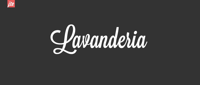
Hello Beautiful
If you’ve spent any time looking at female-oriented brands on Instagram, you’ve probably seen a post or two featuring this font style. The Hello Beautiful font family, designed by Nicky Laatz, is a brushstroke-inspired font with a look that is both bold and eye-catching, yet casual and playful.
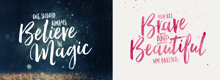
Best Fonts for Posters
So, what is the best font for your company? The answer depends entirely on two things: your message and your audience. Whether you are looking for a stylized look with a decorative font or a classic sign that gets right down to business, you can always us a high-quality online printer to create the perfect poster for your company.
IMAGES
VIDEO
COMMENTS
For this we recommend the following font sizes as a minimum for your text (based on an A0 size): Title: 90. Headers: 40. Body text: 36. Your body text should be easily readable from 1 metre away. To check that you have the right sizes, I suggest zooming in on your poster to 100 %. Then, take a step back to a metre or so.
Choose your fonts. For maximum impact, choose different fonts for the header and body of your poster. Select a serif font for your title and a sans serif font for the body. Serif fonts, such as Times New Roman and Garamond, have short lines at the ends of the strokes in a letter (as indicated by the arrows in the images below); sans serif fonts ...
Presentation Font #26: Dela Gothic One. Dela Gothic One is a thick and chunky font with a strong feel. It's ideal for headings on posters, packaging and in titles on presentations. This font has a lot of power and is best paired with a simple sans serif font or even a classic serif like Garamond for body copy.
For professional posters, go for clean and readable fonts. Helvetica is a classic choice, and Gilmer offers a modern touch. These fonts convey clarity and professionalism, making them ideal for corporate and academic posters. Remember, readability is key in a professional context.
HAUS Sans Extra Bold. Thin strokes have no place with HAUS - it's a big and bold font that's perfect for any graphic design project focused on making text stand out over imagery. MADE TOMMY. If you feel like the best fonts for posters have to be as clear and simple as possible, MADE TOMMY is a great choice.
The body of your poster should have a minimum 24 point font. Viewers should be able to read your smallest text from a few feet away. The title of your poster should have a 50+ font size, depending on the size of your poster and the length of the title. Do not use all uppercase letters for the title or body of the poster.
8. Nectarine. Free or paid: Free. About: Nectarine is beautiful, playful and quirky font, that is great for lively and fun poster designs. Go To Canva ». 9. Kare. Free or paid: Free with Canva Premium. About: This font is perfect for posters needing a bold, attention-grabbing, and contemporary look.
7. Maine: Book Antiqua. Moving on to presentation fonts, here's a clean and modern font based on the roman typeface, Book Antiqua. If you want to give a professional, no-nonsense impression in your presentation, this font is the one you're looking for. Maine is specially designed for creating more legible body text.
Snowy - Winter Floral Color Font. Snowy is a unique font that features a floral design most suitable for winter-themed poster designs. The font has been created using a new font format known as OpenType-SVG. You'll need Photoshop CC 2017 or Illustrator CC 2018 or better to use this font.
How will you choose and maintain consistent, clear fonts to ensure your poster is easily readable from different distances? To ensure legibility at a distance, use around 70-100 pts for the main title, 40 pts for subheadings, and 24 pts for body text. ... Free Editable Poster presentation Examples | EDrawMax Online. (n.d.). Edrawsoft. https ...
Price: Free for personal and desktop commercial use. 17. Frank Poster Font. Frank is a classic bold typeface that is perfect for creating eye-catching poster headers. The font pack includes 5 weights and 4 styles, so you can easily use the same font for both headers and paragraph text within your poster designs.
Step 3: Write the content. Write or rewrite the content for the sections in your poster presentation. Use the text in your research paper as a base, but summarize it to be more succinct in what you share. Don't forget to write a catchy title that presents the problem and your findings in a clear way.
Without further ado, let's dive into the 14 best presentation fonts. 1. Helvetica. Helvetica is a basic Sans Serif font with a loyal user base. Originally created in 1957, Helvetica comes from the Latin word for 'Switzerland' where it was born. When you use Helvetica, the top-half part of the text is bigger than in other Sans Serif fonts.
Calibri. The default champ for a reason! Calibri is friendly and easy on the eyes, making it a solid pick for lengthy presentations where you don't want to tire out your audience. Tahoma. Tahoma's like Arial's more laid-back sibling. It's simple, clear, and does the job well, especially in smaller sizes. Verdana.
Using 24-36pt font for your poster font size is a good place to start. Edit and trim the text as needed, and adjust the font size until it fits well in your selected space. Font size suggestions are based on a specific poster size, but here are a few general size guidelines for you to consider: For the major sections of the poster: Title: 85pt
7. Noir Pro. Image Credit: Evanto Elements. Noir is a sans serif font family of 12 fonts, ranging from light and elegant weights perfect for a small text to extremely heavy and masculine weights suited for large display sizes. Noir is a collection of versatile fonts that can be used together or separately.
Advertisement. 2. Blandit Logo Big Fonts for Posters (OTF, TTF, WOFF) This font is a great choice if you're looking for cool fonts for posters. It's bold, stylish, and has a lot of potential to work for a variety of aesthetics or genres. You also have a lot of choice with how decorative things get here.
For complementary serif/Roman type (especially in a proposal or document), I use Adobe Caslon combined with Myriad Pro headings, or Times New Roman combined with Helvetica headings. Helvetica/Arial is the safest. Search Universal Design. Just looked through pictures I took of posters from my last conference.
3. Arial. Arial is the standard font for most word processors, like Microsoft Word and Google Documents. The reason is it's both clean and contemporary. The font works great for body text, but you can adapt it for almost any media form. Arial works great for informational posters and is an excellent complement for busier fonts. 4.
No wonder TT Ricordi Fulmini goes so well with the poster design for the miniseries Dead Ringers. 8. "Angry" TT Ricks—for a poster with personality. A sharp and edgy TT Ricks is another expressive font that will become a standout element on your poster. This typeface performs at its best in medium to large point sizes.
Segoe: Segoe, a sans-serif font developed by Microsoft, is known for its clean and modern look. With rounded letterforms and balanced proportions, Segoe offers a friendly and approachable aesthetic, making it ideal for professional presentations. Its versatility and legibility across various screen sizes contribute to a seamless visual experience.
Futura. Futura is a clean, geometric-style font inspired by the Bauhaus design style popular in Germany from 1919 to 1933. This is a great font that looks retro and futuristic simultaneously, and its slender letter shape makes it readable at very small fonts. Many designers use Futura for logo design, copy text, or brochures because it is clear ...
Aleo. Classification: Slab Serif. Try using the font Aleo created by Alessio Laiso for a more approachable effect for your poster design. It is a slab serif font that has three different font weights, as well as italicised versions as well. Like most slab serifs, it appears to have a strong and bold personality.